Prerequisite Knowledge and Objectives
At this point, students should know how to plot points, how to create a scatter plot, and how to identify the type of correlation that exists between two variables.
Students will be able to draw a line of best fit given a scatter plot. Students will revisit this idea after they have learned to write the equation of a line. For now, they will use the line to make predictions about future outcomes.
Main Activity: Human Graphing
Students will learn to fit data with a linear regression and to then use said regression to either interpolate or extrapolate data.
Before class begins, create a giant coordinate plane on the floor using tape. If you have the resources, you can use different colored tapes for the axes and for the grid. You will also need at least two different colored strands of yarn.
Next, have students stand on the graph at specific points. Two students will create a line of best fit using a piece of yarn and standing at the edges of the graph. The goal is to make sure that about half the points are above the line and half are below. The line may go through some of the points (i.e. the yarn may touch several people), but you should point out to the students that most of the points do not lie on the line. The line of best fit essentially illustrates the pattern created by a set of points. Have the students create different scenarios where they shift around on the graph.
In each scenario, have the students interpolate values for the independent and dependent variables, given the opposite. For example, if x = 2, use the line of best fit to interpolate the value of y. Because the students have not learned to write the equation of a line, the full benefits of extrapolating data from a line of best fit cannot be reached just yet. For this lesson, explain the idea of extrapolation and indicate how looking at the line of best fit can help you determine other points.
We can also use this activity to discuss the notion of outliers. What are they? Why are they interesting? What do outliers tell us about our data? What caused the outliers? Why is it important we don't throw these data points out when analyzing our data? Have a second pair of students create a second line of best fit using a different colored piece of yarn having ignored the outlier. What did that do to our line? Did the line shift? Up or down? How would this affect our interpolation/extrapolation results? Where is the line affected more: inside or outside? That is, does ignoring outliers more strongly affect the results of interpolation or extrapolation? Discuss that extrapolating values from the line takes place much further down the line, so while results may look significant (or insignificant) for interpolation, the extrapolated data are affected even more.
If students need more practice plotting points prior to this activity, preempt this activity by having the students practice graphing points on the coordinate plane.
Extrapolating Data: Fossil Fuel Reserves
Divide the students into pairs and provide each group with a set of data on energy reserves (links to data on crude oil, natural gas, and coal can be found below). Data and graphs can be found online at the EIA.gov website. Have the students create a scatter plot of the data, indicate the type of correlation that exists, draw a line of best fit, and extrapolate how much of their given fossil fuel will remain after a certain number of years (5, 10, 25, 50, and 100 years). Note, for some data, a graph may already be given. In this case, have the students indicate the type of correlation that exists, draw the line of best fit, and extrapolate how much of the fossil fuel will remain. Next, indicate when the energy reserve will dry up according to the linear regression. Finally, discuss the limitations of a linear regression. At some point, the dependent variable will fall below zero. What do negative numbers represent in this case? Can we have a negative energy reserve?
The following links provide useable data on fossil fuel reserves. All links were accessed in July 2010.
|
·
|
Crude Oil Reserves: http://www.eia.gov/dnav/pet/pet_crd_pres_dcu_NUS_a.htm
|
|
·
|
Natural Gas Reserves: http://www.eia.gov/dnav/ng/ng_enr_sum_dcu_NUS_a.htm
|
|
·
|
Coal Reserves: http://www.eia.doe.gov/cneaf/coal/reserves/reserves.html
|
Once the students have completed the activity, have the students present their data to the rest of the class. Use the presentations as a lead-in to a discussion on the restrictions of regressions and to the limitations of fossil fuels as a long-term energy source. Why is it important that we begin researching renewable energy sources right now? Even if certain reserves won't deplete for centuries, what impacts might continued dependence have on the environment? On future generations? Return to the discussion on global warming from Lesson 2. Along with increased carbon emissions, deforestation reduces the amount of carbon absorbed from the atmosphere, thus allowing for an increase in greenhouse gases and a rise in global temperatures. We also saw an increase in certain diseases.
Closing
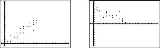
Distribute the following scatter plots. Have the students draw the lines of best fit and extrapolate the values of y for each graph when x = 20.