Karen A. Beitler
I. Jellybean Country- a hands-on graphing activity that allows students to build a human population pyramid out of gourment jellybeans. Materials: Plastic bag with 50 jellybeans (gourmet have more colors) for each student, do not choose them, the populations should make varied pyramids -- this sets the stage for comparison and discussion. Napkins or paper towels to lay the population pyramids on. Encourage students to open up their napkin and place their pyramids one square of their napkin so they will have room for the ‘new’ population pyramid.
Students will have a variety of population pyramids and this is food for discussion; explore reasons why some populations have many young children or a large elderly population. What situations could account for a population pyramid with a specific shape? What predictions could a student make about the history of their Jellybean country? Eating the jellybeans afterwards is up to you. Beads can also be used for this activity -- be sure to find 10 colors. I thought about using different fruits and vegetables to make a big pyramid as a demo- could lead to a discussion of healthy food as well! The chapter online below is a good follow up- I would suggest a Cornell note outline where the students would use graphs to pictorially represent the information. Please reformat the worksheet below to leave room for answers.
Jellybean Country
Name ____________
Many factors influence the growth or decline of populations. As the size of a social group increases, so may its influence on society. In this activity, you will look at different age groups with in a population forming a population pyramid. Then you will explore a change in your population pyramid and work out reasons why such a change would take place. Lastly, you will predict the future of your population if current conditions remain the same.
Name of my country ________________________________________
Obtain a sample of 50 multi-colored “organisms”. Organize your population by color, horizontally, as follows
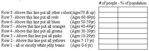
1. Count all rows and determine the % of population [# in row/ 50(total population)]
2. Is the population in your country a developed or underdeveloped country.
Why do you think so?
3. Now, group your population into three age groups as follows

4. Assume that 20 years have gone by, move Rows 7 & 8 to the bottom of your pyramid and fill in the chart below
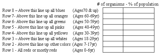
5. What happened to the percentages in your population?
6. Identify three possible influences that would cause this change in your population
7. Predict the changes in your population in another twenty years if current conditions remain the same
II
. Building Population Pyramids -- Paper strip population pyramids are made by the students from grouped population data attained from the U.S. Census Bureau. Similar to the activity above, this activity helps students compare populations that are developed and underdevloped. Teachers will need to cut ten different color paper into half in strips. The strips can be bagged individually for each group of students or left for students to obtain in a common area. Students wil also need scissors, metric rulers, paper glue and 8”x11” tag board or construction paper to glue their pyramids on. A display area for all the pyramids will be most helpful for effective comparison and discussion. Teachers will need to divide students into groups so that enough population graphs are made for comparison. Please reformat the activity below to provide room for answers. Teachers may need to adjust the colors according to what they have available for student use.
Building Population Pyramids
Name _________________
You and your partner are responsible for only one set of population data. Your task is to build a population pyramid by age groups according to the colors and parameters assigned. Be sure to pick a scale and measure each strip exactly so that we can use the pyramids for class comparison.
The colors for each age group are as follows;
-
0-9 yr - purple
-
10-19 yr - red
-
20-29 yr - orange
-
30-39 yr - yellow
-
40-49 yr - green
-
50-59 yr - blue
-
60- 69 yr - white
-
70-79 yr - light blue
-
80-89 yr -- light green
Population Pyramids begin with the youngest members at the base and follow in order of age for each layer above. Be sure to make exact measurements to the nearest millimeter before you cut the paper strip- you will not get more paper strips.
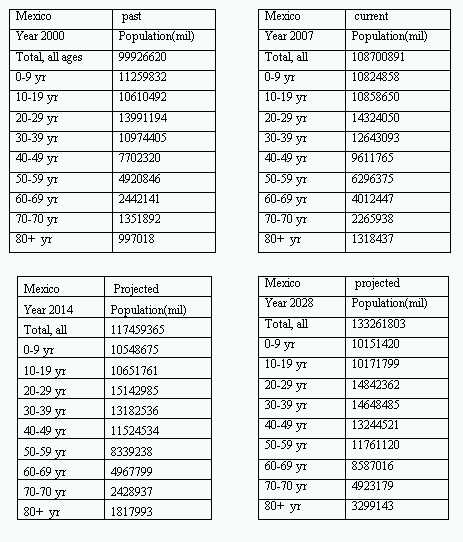
For Mexico
Look at the range of the number of people. Can 1000 people = 1 millimeter? Or 1 centimeter? Determine your scale. Write your scale here ______________
For the United States
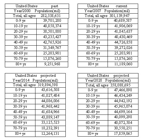
The range of people in an age bracket is from 9,251,968 (80+ yr in 2000) to 47,466,898 (0-9 yr projected for 2028) Do 1,000,000 people = 1 millimeter?
Write your scale here ________________
1. Can you explain why different scales are necessary?
Build your pyramid according to the data chart given to you year. Be sure to check the year and the total population for each age group.
When your strips are cut and in order, glue them onto your paper and answer the following questions about your pyramid.
Questions about your pyramid
2. What shape is your pyramid?
3. Do you think your country is developed or undeveloped in the year you are graphing?
4. What do you predict will happen to your population in twenty years?
Be sure to give at least two reasons why you think this.
After your teacher has displayed all the population pyramids, answer these questions.
Compare your pyramid with the same year for the other country. Remember the size of the pyramid represents a different number of people by 100, 000.
Aside from this obvious difference;
How are the pyramids alike?
How are they different?
Now look at your country over the twenty-eight year time span. For the country you have explain the changes in population and give at least three reasons for this predicted change in population. Are the numbers of people in the age brackets the same? What is expected to happen by 2028 in your country?
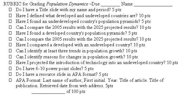
III. How it is done?- instructions for making a presentation
Email beitlerbiologyyahoo.com for a presentation on how to use presentation software to make a presentation.
IV.
State embedded task; Human Population Dynamics teacher and student instructions are found at http://www.sde.ct.gov/sde/cwp/view.asp?a=2618&q=320892 - The task has students create a presentation after examining and interpreting data from the U.S. Census Bureau.
