Nancy J. Schmitt
X vs Y coordinate
Students in Algebra I still have difficulty understanding the Cartesian coordinate system. When looking at a point (x,y), I remind them to remember what comes first in the alphabet is the first letter. That is x comes before y in the alphabet, so when they see an ordered pair, they should write the letter x above the first coordinate. Y comes after x so it is the second part of the coordinate. Again, writing the letter y above the second coordinate will reinforce this convention. The practice that x is plotted on the horizontal axis and y on the vertical axis is somewhat more difficult to remember. However, I found an exercise that is part of the Algebra Lab curriculum in New Haven District and adapted it to help the students (www.ti.education.com). The exercise also helps in seeing how changing one coordinate may change the position of the point.
Graphing in a coordinate plane - Move a triangle and change its shape
Objective:
Students will be able to plot x and y coordinates of points and identify effects of change in x and y values. The exercise may be done with computer software or a graphing calculator or on paper
Instructions for a TI Graphing calculator
Setting up Stat Plot mode:
|
1.
|
Set your calculator to plot mode. Press 2nd key and Y= key.
|
|
a.
|
With cursor pointed to 1: Press Enter key
|
|
i.
|
Plot1 is highlighted. Move cursor to ON and press Enter key
|
|
ii.
|
Move cursor to type that is connected dots, Press enter key
|
|
iii.
|
Move cursor to Xlist and choose name L1 ( press 2
nd
key then 1 key)
|
|
iv.
|
Move Cursor to Ylist and choose name L2 ( press 2
nd
key then 2 key)
|
|
v.
|
Move cursor to Mark and move cursor to the square and press enter key
|
|
vi.
|
Press 2
nd
mode key to exit out
|
-
Entering data:
|
2.
|
Press Stat key
|
|
a.
|
With cursor pointed to Edit press enter
|
|
b.
|
If you don’t see L1 at the top, cursor to the top and then to the right until you see L1 or an empty space. If you see L1, press clear and enter to erase its list. If it is an empty spot then enter L1 by pressing 2
nd
and 1 key.
|
|
c.
|
Do the same thing for L2.
|
|
d.
|
Enter the x coordinates intoLl1 and the y coordinates into L2 For a triangle in the first quadrant use the following coordinates (1,1), (1,4) , (3,1), (1,1) Entering the first coordinate again as the last will complete the figure when graphed.
|
Graphing the data:
-
3. Press the Graph key and the graph will appear.
-
If the graph does not appear, check to make sure the window is correct. The standard window may be created by pressing zoom, then 6 key. Only the first quadrant is shown in the following chart. Quadrants are numbered counter- clockwise.
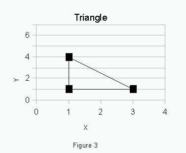
These are the different exercises students :
|
1.
|
Move the triangle up
|
|
2.
|
Move the triangle right
|
|
3.
|
Move the triangle to the second quadrant
|
|
4.
|
Move the triangle to the third quadrant
|
|
5.
|
Move the triangle to the 4
th
quadrant.
|
|
6.
|
Make the triangle twice as tall
|
|
7.
|
Make the triangle twice as wide
|
|
8.
|
Make the triangle into a square
|
The students are encouraged to work in pairs. Through experimentation, the students should figure out what changes to the x or y coordinates make the desired change.
I also use a teacher’s calculator connected to view a screen which allows the graph to be display on the white board or a large piece of paper. This allows the students to see where the triangle had been before they began making changes to the coordinates. Multiple lists also may be used to keep several figures graphed on the same coordinate plane.
X -Y dependent vs independent variable
Which variable is the independent and which is the dependent? Students think that the independent variable is always plotted on the x axis, since this it is taught in the science curriculum. However, it is important from a mathematical perspective for them to understand that choosing the x variable is important in the context of how the problem is presented. The question of causality becomes the key factor. This concept seems to be one of the more difficult ones for the Algebra I students to comprehend, especially when the exercise is presented as a word problem. This is a discussion activity.
Examples 1: Juan receives $ 20 from his Grandmother for his birthday. The card says that he will be receiving an additional $ 5 for each month. How much money will Juan have received from his grandmother in two years?
In this case the independent variable x would be the number of months and the dependent variable y would be the amount of money Juan has received.
Example 2: Jane has a steady babysitting job where she makes $ 6.50 an hour. How many hours must she work to make enough money to buy the new iPod she wants?
In this case the independent variable is the amount of money she needs to make and the dependent variable is the number of hours.
Example 3: A vacation trip has been planned and the Smith family would like to get to keep their gas budget reasonable. How much will they spend on gas if gas is $ 4.28 and their car gets 20 miles to the gal?
In this case the number of miles they will travel is the independent variable and the amount of money spent on gas is the dependent variable.
Relations and Predictions
There a linear relationship between pieces of information when knowing one value will allow you to determine the other value. With a linear relationship there is a constant change in the independent variable that is correlated to a constant change in the dependent variable.
Students should be encouraged to consider if the relationship makes sense.Time series data such as time passes, the money that is deposited in a savings bank increases in amount based on the interest rate paid and has a positive correlation. This is a reasonable example of a linear relationship.
Relation Activity
An exercise that would be fun for the students to do is to determine if the size of a persons head or length of their arm or foot is related to how far they can jump. (McDougall Littel, Algebra I).
As part of this exercise, the students should be able to determine that the dependent variable or y is how far they are able to jump. The independent variable is the size of their head, length of their arm or foot. The students will be put their data into a table. Depending on the age and skill level of the students, pre-printed tables could be provided. All students in the class should be included.
The students will then graph their results on paper. They will then draw in a line of best fit, by eye, where the number of points below the line are about the same number as above the line and that the points are the same distance from the line drawn. They will discuss which of the three independent variables was the best predictor of length of jump. The students could be introduced to interpolation by asking how far a student with a head size falling between two values might jump.
Once the graphs are created and the lines are drawn in, the students can determine the equation of the line. The easiest equation is the slope intercept form, Y = mx + b , where m is the slope, and b is the y intercept. If they extend the line through the y axis, they will approximate the y value, when x equals zero (the Y intercept). Then they should pick two points that are on the intersection of the grid lines and use the points to calculate slope (y2-y1/x2-x1). They can then use their equation to predict points beyond the scope of their data. Ask them how far it is reasonable to extrapolate.
This activity may be done where the graphing is done first on paper, then on computer or graphing calculator. The students can discuss if their results are different in either method and why. Also, on the graphing calculator or computer, a regression line may be created by the software. The students will be able to compare their results to this line.
Reading and Interpreting Graphs
The following scenarios of stock prices will help the students explore the fluctuations of stock prices and use the past to make predictions. The following graphs may be used to make predictions. The graphs on the left have been truncated at a particular date. The students are to use the graphs on the left to make predictions as to how the stock price will do in the near future. The graphs on the right show how the stock prices have actually done. Data from Yahoo.finance.com was used to create these graphs. It is simple to download information directly into graphing software to create similar graphs of any company. Choose companies in which your students express an interest.
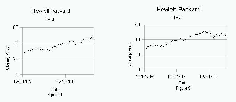
On the graph, figure 4, it appears that Hewlett Packard’s stock price will continue to rise. However, the complete graph, figure 5, shows that it goes down and then levels off.
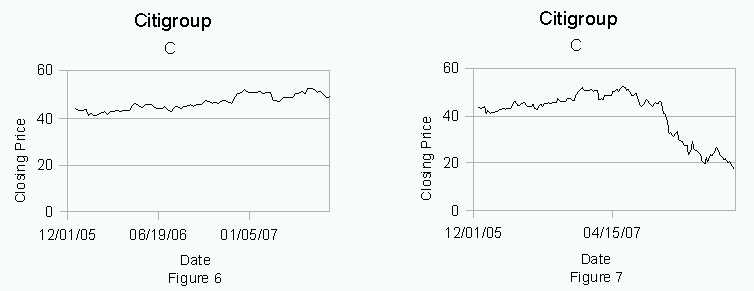
On the graph, figure 6, it appears that Citigroup’s stock price is slightly increasing. The complete graph, figure 7, shows that the price in fact went down significantly.
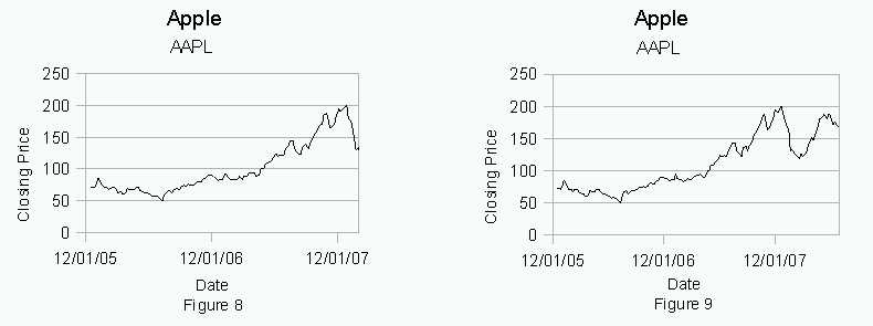
On the graph, figure 8, it appears that Apple’s stock price rises nicely then has a downturn. A prediction of that the down turn will continue would be appropriate, but the stock actually recovers and increases in price as shown on figure 9.
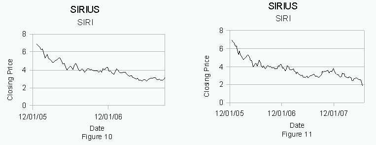
Sirius’ stock price appears to be trending down in figure 10. An appropriate prediction would be that this trend continues. As the graph in figure 11 shows, Sirius stock price continues to trend downward.
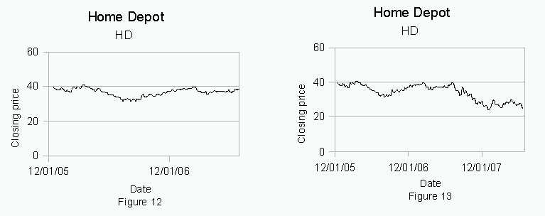
According to the graph , figure 12, it appears that Home Depot stock price is relatively flat and the prediction would be that that would continue. The graph, figure 13 shows that Home Depot stock actually started to trend down.
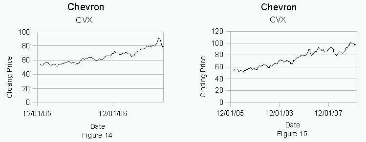
The graph, figure 14, of Chevron’s stock price appears to be on an upward trend. The last blip on it may indicate that there is a downward trend beginning. Students may believe that either is correct. As shown an figure 15, the actual trend is that Chevron’s stock price continues to increase.
As the students analyze these graphs they will perceive that sometimes the price will go up as they thought it would, but sometimes the price will go down.
The Stock Market Challenge
This exercise will combine research with the excitement of making some money. First the students will pick some companies that interest them. They should determine, based on what they know or which companies had the biggest increase in stock price over the past month. They will be required to write down in a paragraph what their reasons are for believing this. Afterwards, they will record the stock prices, using the end of day prices. Their graph will have days on the x axis and stock price on the y axis. They will then plot the points and create a line of best fit. Using their line of best fit they will predict how their best stock will do in a week. Included should be a graph of the most appropriate major indicator, such as Dow Jones average for comparison.
Continuing on with this theme, the students will then take a the same period of time from the previous year and determine if they see a trend. If there is a trend, the students will again graph their data and make a prediction of where the stock will be at the end of the following week. They are to determine if their prediction is better with more data.
What other factors may have an impact? Is the past a clear predictor for the future price where stocks are concerned? The last relation is whether there is a correlation between the price of the stock and how much money the company is making. Some of the Fortune 100 companies should be compared against smaller companies. What are their results?
In addition, the students should compare their results with what some of the experts have predicted. A quick check as to stock prices before and after any large fall in the stock market such as October 1987 and in 1929 could provide a good historical perspective.
Did they make the best decision, which made them more money? Using a current bank rate, have the students graph the result of investing their money in a bank account. Would they have more money? Some may determine that putting their money in the bank is the best decision for them.
Even if the students continue to say “when will we ever use this?”, they will be a step closer to being able to use math to make better decisions and make more money!