Nancy J. Schmitt
Most stocks are charted at least daily. Data is made available as buys and sells occur. Most data are available at a 20 minute lag unless you pay for more current information. Stock charts can be created on any major brokerage web site (Schwab , Fidelity, Smith Barney, Merrill Lynch), yahoo.com, google.com or any financial magazine site.
Many local stocks are detailed in the local newspaper. In most newspapers end of day stock prices are found, along with the high and low price for the day and the high and low for the past 52 weeks. Other financial indicators are also reported such as PE ratio (stock price to earnings ratio), volume traded, EPS (earnings per share), and dividend yield. Business sections of the newspaper also detail important business events that have an impact on the stock market and individual companies.
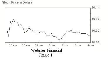
In order to find information for a particular stock, the acronym or code, which was assigned to the company when listed on the stock exchange, is used. Examples are: Webster Financial Corporation: WBS, Ford Motors Company: F, McDonalds: MCD. Figure 1 shows an example of the daily time series chart for Webster Financial.

It has been said that overall investing in the stock market produces better returns than most other investments in the long term. However, recent turn of events in the stock market make it difficult to believe that more money is made in stock market investments than any other area. In 2007-2008 skyrocketing oil prices and sub prime mortgage scandals that have rocked the financial markets. In addition, a worrisome economic picture leaves many investors with very small gains or some very large losses.
In the best of times, investing in the stock market requires research of the company, its management, profits, debt, inventory and current market conditions. Looking at the trend of the stock market price is one piece of vital information that is crucial to making a good decision. Most people are aware of the basic premise to buy low and sell high. Good advice, but being able to interpret whether or not the current time is a good time to buy or sell can only be accomplished by looking at price trends within the bigger picture of the company’s health and economic conditions. Graphs of stock prices are key in aiding the decision process.
Before investing in the stock market, it is important to determine what kind of company you wish to invest in. Just as important, is the fact that it can be risky to invest in the stock market. Only invest money that you are willing to lose. To minimize your risk, research becomes the key.
Companies typically fit into what is called a sector. Some of the major sectors are: Financial, Health Care, Energy and Utilities, Entertainment, and Transportation. Are certain sectors currently doing really well? If so then that may be a good starting point. Right now financial stocks are not doing very well as a group, so that would not be a good choice, unless your research shows that you believe they are close to the bottom and you are willing to take the risk. Oil stocks are doing quite well right now, so you may decide that an oil company is the right choice.
Once a decision is made as to what kind of company makes sense, then research to discover the best company for you to invest in, will help you make a better decision. Look at all of the information that is available about the company, annual reports, what analysts are projecting. If income is important, choose a stock that distributes dividends. The higher the yield, the better. If income is not important to you, but investing for the future growth is, then look at a growth stock. Some of the growth stocks are not yet making a profit, so they can be a riskier investment. Compare the stock to how well the Dow Jones average is doing, or one of the other appropriate indices. Consult with a broker, but remember, in the end, it is your own decision.
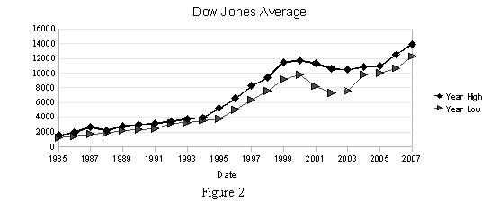
Historical prices are readily available for individual stocks on the Internet on any of the major brokerage firms or search engines such as Yahoo or Google. The chart of the high and low closing prices of the Dow Jones Industrial Average shows a distinct upward trend from the mid 1980 until 1999, then a distinct downward trend, with a short upswing. The graph of Dow Jones Average is shown below, figure 2.
