Beth E. Klingher
Lesson 1: Introduction to Misleading Graphs (1 Day)
The curriculum unit will begin with a brief introduction to some misleading graphs. Students will be shown a series of graphs which use a variety of questionable practices to deceive or mislead the viewer. (These practices include manipulating the scale or axis of the graph, displaying partial data, or using pictographs to exaggerate the rate of increase or decrease.) Students will be asked to see if they can identify the techniques the author may be using to manipulate the viewer’s reaction. This initial lesson will introduce students to the topic of misleading graphs and encourage them to question what they see and why the author may have chosen to display the information in a particular way.
Objectives
Students will analyze and compare various graphs in order to determine if the graph is misleading. Students will identify common techniques which may mislead the viewer or alter the representation.
Activities/Procedure
Warm Up/Do Now Activity:
Students will begin the class by taking a short quiz on misleading graphs and statistics. The quiz includes many of the common methods used in misleading graphs. Challenge students to find out how the graph is misleading. Once students complete the quiz, have students share their responses with the class. Help students to identify the methods used in each of the misleading graphs or statistics as follows:
-
1. In a middle school of 2,000 students, 25 girls were chosen to determine the average height of a middle school girl. The first 25 girls who entered the cafeteria at noon were chosen as the sample.
-
-
Discuss the bias in this sampling method. Is it representative of the whole school? Perhaps only the 6
th
grade eats at noon, then the sample would not include 7
th
or 8
th
graders. Perhaps the first 25 girls were just coming from basketball practice and include most of the basketball team. In either case, the sample would not be random.
-
-
2. One hundred and twenty people were surveyed to see which coffee they preferred. The following graph is being used to promote Willy B’s brand coffee as the best coffee in town. (See Figure 1.)
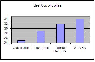
Figure 1
-
Note that the scale has been altered on the graph to emphasize the differences between the bars. It appears as if the difference between the four types of coffee is quite significant because the scale of the vertical axis starts at 24. The graph looks as if Willoughby’s coffee is by far the best, although it has scored only 2 points higher than Donut Delight’s coffee.
-
-
3. Following are the grades from a recent mathematics test given to a class of 10 students: 44, 47, 48, 60, 95, 96, 96, 97, 98, and 99. The mean score was a 78, the median was 95.5 and the mode was 96. Was this a fair test and do you think the students did well?
-
-
Measures of central tendency can often be misleading when used to represent a group of data, especially if the data includes outliers or is distributed into two distinct groups. Students must be cautious of using a single number as the “typical” or “average” without analyzing the data to see if this number is truly representative.
-
-
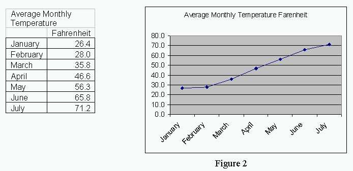
4. The average monthly temperature in New Haven, CT is shown in the table and graph below. This data clearly supports the idea that global warming is occurring in New England. (See Figure 2.)
-
It may be obvious to most students that this graph only includes data from the first half of the year; however, this technique is often used to mislead viewers. By showing only part of the data, the graph can support almost any position desired. In this case, only January through July is shown to support the claim that the temperature in New Haven is increasing which must be due to global warming.
-
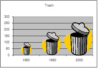
5. The following graph shows the increase in trash produced in the United States from 1960 to 2000. (See Figure 3.) Does this graph accurately illustrate the data? Why or why not?
-
-
-
Figure 3
-
-
The trash can used in the pictograph grows two dimensionally, exaggerating the growth rate. Although the data almost doubles from 1960 to 1980 it appears as if it grows 4-fold. The data grows by exactly the same amount from 1960 to 1980 as it does from 1980 to 2000, but because the picture grows two-dimensionally it appears to be a much more significant increase from 1980 to 2000. The use of pictures is often used as a technique to mislead the viewer.
Lesson:
As a class, list the techniques used in the previous graphs to mislead the user. Ask students to come up with examples of each. These techniques will be discussed in much more detail in the subsequent lessons, so the goal here is to get students thinking about these ideas, not to exhaust each of the topics.
-
1.
Data Collection
. How was the data gathered? Was it obtained using a scientific method? Was there bias in the way the questions were worded? Was random sampling used? How or who was asking the questions of the respondents and could this create a bias?
-
2.
Data Analysis
. What techniques are used to analyze or interpret the data? Is some data left out? Is there an even distribution of the data or are there outliers? What is the range of the data? Is the data spread out or clustered tightly together? Do the measures of central tendency (mean, median and mode) accurately reflect the data?
-
3.
Data Graphing
. Does the graph accurately illustrate the data? Do the scale and interval chosen display all of the data in adequate detail? Do labels clearly explain the data being graphed? Is the data grouped in such a way as to hide certain elements of the data? Is some of the data left out?
-
-
Wrap Up/Homework
: For homework, students are asked to find one or two examples of graphs in newspapers, magazines or on the internet. They should write a paragraph or two explaining why they think the graph accurately portrays the data or why they think it may be misleading. They should list any questions which they have about how the data was obtained or analyzed.
-
Lesson 2: Collecting Data (2 Days)
This lesson will begin with a discussion of how data are collected and how different sampling techniques can affect the results. Some real-life examples of sampling will be discussed including political polls, census taking and voting for such shows as “American Idol.” Different sampling techniques will be reviewed, including random versus non-random samples and how to avoid selection bias. Some time will also be spent on potential bias in the way in which survey questions are phrased, and how surveys can also be bias by the manner in which they are conducted.
Objectives
Students will explore the purpose of a survey or poll and discuss how this purpose may bias the way the survey is conducted and the questions being asked. The students will also learn about different sampling techniques and how these techniques may affect the results of the survey.
Activities/Procedure
Warm Up/Do Now Activity
: Students will begin the class by splitting up into two groups - by gender. Although both groups may indeed have similar answers to the survey questions, it is assumed that there will be some significant differences between the boys and girls groups. The intention here is not to exaggerate these differences, but simply to show how limiting survey questions to only one gender or group could bias the results.
Students are asked to answer the following questions:
-
1. How many hours do you spend shopping for clothes each
month
?
-
2. How long does it take you to get ready for school in the morning?
-
3. How many
hours per day
do you spend playing computer or video games?
-
4. How many
hours per week
do you play sports?
Each group is then asked to tally the questions and come up with a mean, median and mode for each question for their group. The results are then put on the board and the following questions are asked:
How do the results differ for each group?
Do you think either of the results describes the “typical” 7
th
or 8
th
grader?
What accounts for the differences between the two groups?
How could we change the survey to get a more representative sampling?
Lesson: Ask students to provide examples of surveys or polls that they have seen or heard about. Discuss how these surveys are conducted. Who asks the questions? What questions are being asked? How are the questions phrased? And, who are they asking?
Sampling is a technique used to survey a small portion of the population in order to infer information about the entire population. For example, a small group of people may be asked what ice cream flavor they prefer and the assumption is the ice cream flavor chosen will also be the favorite flavor of the larger population. Discuss with students why sampling might be used rather than a survey of the entire population. Some items which might be discussed include the reduced cost of sampling, the fact that it is easier to perform a smaller survey, and the difficulty of conducting a survey of the entire population.
The US government performs a census of the entire population every ten years. Recently, there has been discussion about using sampling techniques instead of a complete door to door (or mailbox to mailbox) census. Have students break up into small groups to discuss the pros and cons of sampling versus an entire census. (Graphic organizers which show the pros and cons of each might be used to record this information and make it easier to discuss with the class.) Share the results among the class.
Discuss sampling bias. Sampling bias can occur in many ways. Some examples of sampling bias include:
-
·
Participants
- pre-screening participants or asking for volunteers within specific groups. For example, conducting a survey about exercise rates at a local fitness club or asking about political preferences at a political rally. Sometimes, surveys can also distort the truth by removing participants who do not complete the test, for example, if you were testing the efficacy of a dieting program and you eliminated all those who dropped out, your results would eliminate all those for whom the diet program wasn’t working. Another type of participant bias is self-selection bias. This occurs when people can decide whether or not they want to participate and their decision may be related to their level of interest in the survey, creating a non-representative sample. For example, people who have strong opinions or substantial knowledge may be more willing to spend time answering a survey than those who don’t. Examples of these types of sampling include political polls, telephone surveys, voting for “American Idol”
-
·
Selection Bias or “Cherry Picking”
- when particular data points are chosen to support a claim or when “bad” data is removed because it doesn’t support the claim. This can also happen when surveys or experiments are repeated and only the most favorable results are reported. In addition, the data can be “cleansed” by removing an outlier - which may show an anomaly in the data. However, this anomaly may highlight an issue or opinion of importance - and removing this data may mask this information.
-
-
·
Sample Size
- Most students can understand that a small sample size may not represent the entire population, and that the larger the sample size, the more accurate the representation. (This is sometimes referred to as the law of large numbers.) However, simply increasing the sample size may not be enough to ensure you are truly sampling a representative group of the population. Effort must be made to include representatives from all demographic groups within a population.
-
-
·
Spatial Bias
- Changing the beginning or end-point of a sample to exaggerate or minimize a trend. An example of this would be to show stock market growth from the depths of the depression to the 2000 internet stock market boom. This would exaggerate stock market growth by starting the data when the market was at its lowest point and ending the data at a record high. Data can also end prematurely to show the success of an experiment without including subsequent failures.
Activity
: Students will create their own surveys to gather information about how students feel about their school. However, the catch is that the survey should be biased towards a positive result. Students will work in small groups or pairs. Students will discuss how to phrase the questions in such a way that negative views will be obscured, hidden or ignored. In addition to creating the survey questions, students will also explain how the survey will be conducted to favor a positive outcome and who will conduct the survey to assist in this process. Students will complete the survey and present their results to the class.
Survey Topic: How do students feel about their school? Be sure to answer the following questions:
-
· Who will conduct the survey? (Teachers, principal, students)
-
· How will the survey be conducted? (Phone, written, in-person, anonymous)
-
· Who will answer the survey? (How will the sample group be chosen?)
Wrap Up/Homework
: Explain how the following surveys may show bias. How could they be improved to be more accurate?
-
1. Telephone poll using a random list of names from the local telephone book.
-
2. Government Census using names and addresses from all tax payers.
-
3. Call in votes for your favorite singer on
American Idol
or another reality TV show.
Lesson 3: Analyzing and Interpreting Data (2 Days)
In this lesson, we will introduce students to the normal distribution or bell curve. We will analyze data which falls into a normal distribution and discuss why this is the case. Next we will move on to bi-modal and skewed distributions and discuss the affect of these types of distributions on measures of central tendency (mean, median or mode.) We will also explore the effect of outliers on these measures and how clustering of data may also affect the results. Box and whiskers charts will be used to analyze the distributions of the data.
One particular data set, the Anscombe quartet, illustrates this concept quite well. (The Anscombe quartet can be found in numerous sites on the web and in print.) The quartet is made up of four sets of paired data. Each data set has the same statistical measures: mean, variance, correlation and linear regression. When these data sets are graphed, it is clear they are very different sets of data with different distributions. However, they may appear identical or closely related when one views only their statistical properties. The data was created by F. J. Anscombe to emphasize the importance of graphing the data before analyzing it. (Illustrations of the Anscombe quartet can be found on Wikipedia at www.wikipedia.com as well as many other internet sites.) Francis J. Anscombe “Graphs in Statistical Analysis” American Statistician 27:17-21, 1973.
Objectives
Students will learn about the effect of data distribution on measures of central tendency, including normal, bi-modal and skewed distributions, clustering and outliers.
Activities/Procedure
Warm Up/Do Now Activity
: Begin the class by providing students with the following story problem.
Three salespeople were having dinner together. They were comparing the amount of money they earned last year. The first salesperson said “I made $ 65,000 last year.” The second said, “I did too! The third salesperson said. “I did even better; I made $ 80,000 last year!” What was their average salary? Later that night they were joined by another guest, Bill Gates, president of Microsoft. His annual salary is about 1 million dollars per year. What is the “average” salary of the four diners? Does this amount represent the “average” diner at the table?
Students usually answer questions like this using the mean. However, by adding an outlier to the numbers, students should be able to see that the mean may not be a good representation for the data, and the median may be better, although even this statistic does not portray the “average” diner very well. Discuss the mean, median and mode and how these measures may be affected by the distribution of the data.
Lesson:
Start the lesson with a brief review of data collection techniques discussed on the previous day. Once data is collected through a survey or experiment, it must be analyzed or interpreted to determine what it means; what is the favorite ice cream flavor for 10 to 13 year olds, what is the average height of a fifth grader or how much money can I expect to earn with just a high school diploma? In order to analyze data, the first step is to understand how the data is distributed.
Data often follows a particular pattern called a normal distribution. A normal distribution is one where the data are evenly distributed around the mean or average. This is usually done by plotting the data in a histogram to see what the data look like. Normal distributions form a bell curve, with most of the data clustered around the mean and equally distributed on either side.
Normal distributions have the following characteristics:
-
- the curve has a single peak
-
- the curve is bell-shaped
-
- the mean of the data is at the center of the distribution (equal to the median)
-
- the distribution is symmetrical around the mean
Many real-life situations result in data which is distributed in a normal distribution or bell curve. These include height, weight, number of heartbeats per minute, test scores, salary levels, as well as probability calculations.
Although quite a lot of data are distributed in a normal distribution, there are many types of data where this is not the case. At this point, students can also be introduced to the following terms. Ask students to see if they can come up with examples of data which may be distributed in each way, and discuss how these data types might affect the mean, median and mode of the data.
-
· Skewed Distribution is data which has an asymmetrical graph, tapering off on one side or the other. Data can be skewed to the right or to the left. The skewed sides of the data are called tails.
-
· Bimodal Distribution is a distribution where there are two modes, creating two humps in the graph. (Multimodal distributions are also possible.)
-
· Clustered Data is data which clusters around certain numbers; creating subsets of the data. It is often helpful to analyze each of the clusters separately as they may share certain traits.
-
· Outliers are numbers which may be distant from the rest of the data. Outliers often distort calculations of the mean.
Students will spend some time reviewing a variety of data sets using histograms found on a web site from Shodor Education Foundation, Inc. which provides an interactive activity on histograms. (www.shodor.org/interactivate/activities/Histogram/)
Box plots or box and whiskers plots allow students to further analyze these same data sets. (See Figure 4.) You may want to provide a brief review of how to analyze or construct these type of plots. Be sure to define the following terms, often called the five number summary:
-
· Maximum - the largest number in the data set. This becomes the top end of the whiskers.
-
· Minimum - the smallest number in the data set. This is the lower end of the whisker.
-
· Median - the center of the data. It is the middle value in a list of sorted numbers. If the list has an even number of values, the median is the mean of the middle two numbers.
-
· Upper quartile - the median of the upper half of the data.
-
· Lower quartile - the median of the lower half of the data.
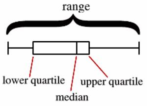
Figure 4
(It may also be necessary at this point to discuss the meaning of the word outlier in greater detail. An outlier is a piece of data that is significantly above or below the rest of the data. Statistically, an outlier is at least 1.5 times greater than or less than the interquartile range. The interquartile range (IQR) is the middle 50% of the data, or the data which falls between the lower quartile , Q1, and the upper quartile, Q2.)
Students will then review the same data sets which were just used for histograms, but this time, the data is shown as a box plot. Use the web site from Shodor Education Foundation, Inc. which provides an interactive activity on box plots. (www.shodor.org/interactivate/activities/BoxPlot/)
Activity: This activity lets students view and make their own histograms and box plots using the preset data. Have students graph the data using the interactive Shodor applets. Have students answer the following questions for each data set.
-
1. Are the data distributed in a normal distribution curve? Why or why not?
-
2. Are the data is clustered around certain numbers? If so, explain.
-
3. Are the data skewed in one direction or the other?
-
4. Are there any outliers in the data? Why?
-
5. How would the distribution of data in this data set affect the mean, median, and mode?
Have students compare and contrast the box plots with the histograms. (They may choose to open two windows and view the plots side-by-side.) Do the box plots help to identify the distribution of the data? What do the box plots show that the histograms do not? What do histograms show that box plots do not?
The same data sets can be found on the National Council of Teachers of Mathematics website called Illuminations. This site also provides an interactive activity for students to try. (http://illuminations.nctm.org/ActivityDetail.aspx?ID=77.) Choose the option “Graph by category” to see all the box plots for the data set displayed in a single graph. This presentation is particularly powerful because you can compare the median data point for each of the data sets as well as how the data distribution compares.
Another excellent web site which allows students to create histograms and box plots is the National Library of Visual Manipulatives (http://nlvm.usu.edu/en/nav/category_g_3_t_5.html.) Choose either the box plot or the histogram option. A preloaded data set is provided with a bimodal distribution. Students can toggle back and forth between a histogram and a box plot to see how the data is displayed in both representations. Students can also enter their own data and see it plotted.
Wrap Up/Homework
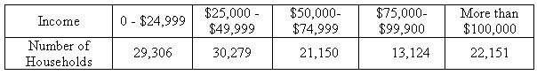
: Provide students with the following actual data on household income from the 2006 US census. According to the US Census Bureau, the median household income for 2006 was $ 48,201 and the mean was $ 66,570. Ask students to analyze the data by creating a histogram, and then interpreting the graph. How does the distribution of the data affect the mean and median? Which measure of central tendency - the mean or the median - is a better indication of “average” household income? Ask students to defend their choice.
Income Per Household 2006 (total US households: 116,010)
Lesson 4: Organizing and Representing Data (2 Days)
Before data is actually graphed, decision must be made as to what data sets should be included in the graphs. Students will learn how they can alter the results of the graphs simply by choosing to include or leave out some elements of the data. (This is often referred to as “cherry picking.”)
Once the data set is chosen, the information is usually organized into tables and charts. Very often, decisions are made at this stage in the process as to how the data should be grouped. By combining certain data sets, different elements can be reinforced, exaggerated or disguised.
Finally, students will gain some experience actually graphing the data. The choice of scale, interval and graph type will be discussed in-depth, and how these graphical elements can be manipulated to alter the presentation of the graph. Microsoft Excel will be used extensively to enable students to easily experiment with their graphs, changing various elements to see their effect on the viewer. At this point we will also introduce the concept of proportionality and how this is used in pictographs to exaggerate the results.
Objectives
Students will learn how the design of graphs can misrepresent data in order to mislead the viewer. By altering the axis and scale, manipulating the intervals, or adding other graphic elements, such as pictures, graphic designers can influence the way the data are understood.
Activities/Procedure
Lesson
: The most common form of creating misleading graphs is to modify the actual presentation of the data. This can be done in a variety of ways. I have chosen to highlight some of the more common methods used:
-
· modifying the axis or scale,
-
· manipulating the intervals or how the data are grouped,
-
· choosing to show only a subset of the data,
-
· using pictures, perspective or other pictorial means to distort the data,
-
· using financial data which are not adjusted for inflation.
Modifying the Axis or Scale
The first method, altering the axis or scale, is a fairly common practice and can be seen in many newspaper and magazine graphics. Often, the graphic designer will start the scale at a point above zero, closer to the beginning of the actual data points, in order to highlight the difference between the data sets. This technique is often a valid approach to understanding small differences between categories; however, it must be made clear to the viewer so as not to distort the meaning of the graph.
The following graph, average rainfall, highlights the large increase in rain during the month of March. (See Figure 5.) However, the graph seems to exaggerate the difference between the amount of rain in March and average rainfall, which is only 0.4 cm. In addition, it is not clear what the “average” is based on. Is this the ten year average? 50 year average? Is it based on the town’s rainfall, the county, or the state?
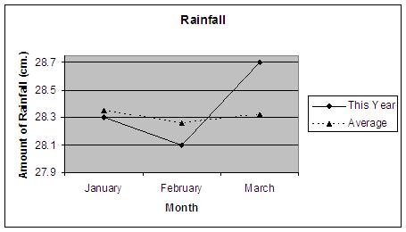
Figure 5
The next graph, which displays plant growth of four test plants, also starts the scale at a point greater than zero in order to highlight the different heights of the four plants. (See Figure 6.) However, in this case, the axis label clearly states the fact that the scale begins at 47 cm, not at zero. The designer wants to focus the viewer’s attention to the small differences between plant A, B C and D, but seeks to inform rather than deceive.
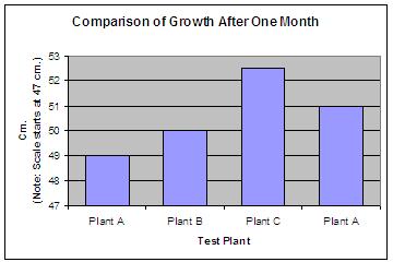
Figure 6
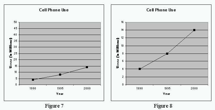
Another method of altering the axis is to use very large intervals to make the differences in the data appear insignificant. This may result in data which appears to have very slow growth curve, but in fact, is growing quite rapidly as in the data below. (See Figures 7 and 8.)
Sometimes, graphic designers eliminate the axis altogether, so that the viewer can only interpolate the difference between bars or points on a line, a clear deception on the part of the designer.
Manipulating the Intervals or Groupings
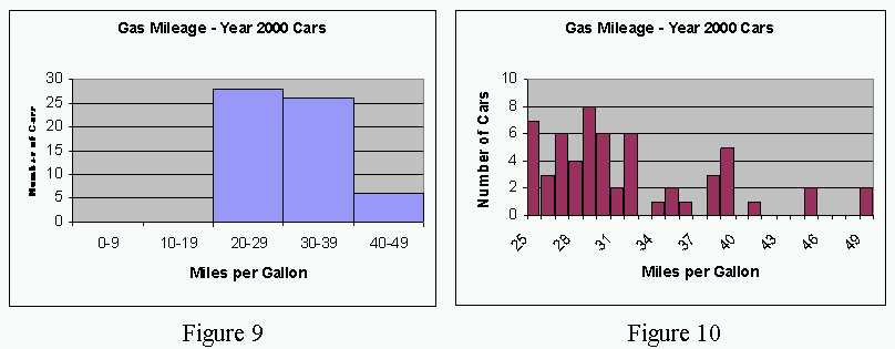
The second method to discuss is how the data is grouped. Often data can be combined in such a way as to mask certain information. The data below shows gas mileage for 2000 model cars. The first histogram combines data for all cars which have from 20 to 29 miles per gallon, 30 to 39 miles per gallon, and so on. (See Figure 9.) This clearly masks the fact that the data is clustered into a few different and distinct groupings. (See Figure 10.) The majority of cars appear to have a mileage rating of 25 to 33 miles per gallon. A number of cars can also be loosely grouped into 35 to 37 miles per gallon, and 39 to 42 miles per gallon. There are also a small number of cars which have significantly higher gas mileage. The data are not evenly distributed and may be masked in the first graph by combining the data into a small number of categories.
Another method of grouping data inaccurately is to combine groups of data which may not really be the same. For example, when looking at the demographics of a population, different minority groups may be combined to segment the data into definable categories. For example, when analyzing the data about certain habits, it may not make sense to combine all Hispanics into one group. People of Mexican descent may have very different habits from those of Spanish, Puerto Rican or Central American descent. New immigrants may also differ in their habits from people who have been in the US for a number of generations.
Show a Subset of the Data
The next method to discuss is the actual make-up of the data. Data may be collected through an experiment, survey or another method of data collection. Before graphing the data, choices are often made as to how much of the data to use. In many cases, some of the data may be suspect for a variety of reasons. The data may be from an incomplete survey; it may have been obtained using questionable practices, or it there may have been certain experimental controls which was not entirely accurate. There also may be quite a lot of data to analyze, and a decision will have to be made as to how much of the data to include or exclude. There may also be outliers, data that appears way out of whack with the rest of the data. Should these outliers be included or just ignored?
Choosing to include or exclude certain subsets of the data is a frequent method used to mislead the user, whether done consciously or by accident. Cherry picking usually refers to using only that data which supports your claim or point of view, thereby creating a graph which will support your claim. You can also choose to leave out certain data which contradicts your point of view. In some cases, this may be valid, as when one chooses to remove an outlier for valid reasons. However, even when these outliers are removed from statistical calculations and graphs, it is always a good idea to note these outliers as they may have significance.
An excellent web site which provides an in-depth analysis of cherry picking can be found on the New York Times site in the column Freakonomics. (http://freakonomics.blogs.nytimes.com/2008/02/11/analyzing-roger-clemens-a-step-by-step-guide/.) This article analyzes data which was provided by Roger Clemens, the famous baseball pitcher, to refute charges that he was involved in the use of illegal, performance-enhancing drugs. The authors provide a step-by-step analysis of data which were used refute the charges. One of the main techniques Roger Clemens’ supporters used was to choose a small “cherry picked” comparison group of other pitchers. When the authors expand this group to include a more pitchers, it becomes obvious that the data do not support this case.
Another way to manipulate the data is to analyze a portion of the data or specific time period. A good example of this is when analysts look at historic returns on the stock market. Depending upon the start and end dates, you can show significant growth over time, steady growth or stock market decline - all depending upon what you pick as a start and end date for your analysis. The web site StockCharts.com allows user to alter these dates and see the growth of the stock market. (http://stockcharts.com/charts/historical/.)
Another topic of recent interest is the rapid growth and decline of housing prices. A graph of overall housing prices can be found on the New York Times web site. (www.nytimes.com/imagepages/2006/08/26/weekinreview/27leon_graph2.html.) It may be interesting to compare and contrast these data with local housing prices - from a specific neighborhood, town or region of the country. Students should note the wealth of information presented in a graph like this - including historic indicators to reference the time period, and monetary adjustments so that nominal, inflation adjusted dollars are used. Analysts can use portions of subsets of this graph to prove a number of contradictory points of view, depending upon which subset of the graph is analyzed. You should also note that this graph stops at 2006, about the time that housing prices started to fall precipitously.
Using Pictures, Perspective or other Pictorial Means to Distort the Data
Another method we will analyze is the use of three dimensional pictures or other graphics to distract or mislead the viewer. A pictograph is basically a bar graph which is made up of a picture related to the topic of the graph. Most often the picture is repeated a number of times to replicate a bar of data, as in the following graph. (See Figure 11.)
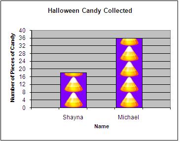
Figure 11
However, when the picture grows in two dimensions, width as well as height, it misleads the viewer by presenting a two-fold growth in the area or size of the picture, as illustrated in the following graph. (See Figure 12.)
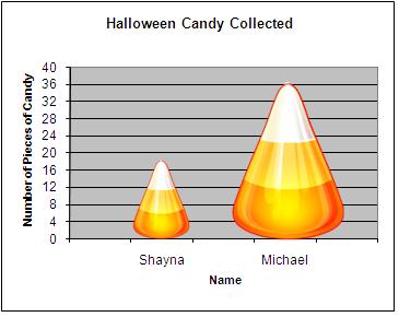
Figure 12
An excellent web site which displays a number of misleading presentations is from Simon Fraser University (www.math.sfu.ca/~cschwarz/Stat-301/Handouts/node9.html.) Ask students to review each of the graphs on this web side and analyze how the graphic designer has chosen to mislead the viewer or obscure the data.
Ignoring the Effects of Inflation
The last technique we will discuss involves the use of financial data in graphs. As you may know, a dollar in 1950 was worth more than a dollar is worth today. But, what does this mean? Students need a basic understanding of inflation and how the value of a dollar buys less today than it did 10 years ago. For example, a hot dog only cost 10-cents in 1929, but costs close to $ 1.50 today. Other items have had similar increases in costs. Some factors which affect this in addition to inflation include the cost of labor, transportation, materials, and energy, trade with other countries, as well as supply and demand.
In the context of this unit, it is important that students are aware of the affects of inflation on the value of money and that all graphical displays should account for the changing value of money over time. A wonderful graph can be found on the web site Inflation Gap.com (http://inflationdata.com/Inflation/Inflation_Rate/Gasoline_Inflation.asp.) It illustrates the change in the price of gasoline over time. The top line shows the inflation adjusted price of gas versus the lower line which shows the actual price of gas. This graph illustrates that although the price of gasoline is at an all time high, it is not much higher than the historical price once it is adjusted for inflation.
The U.S. Department of Labor - Bureau of Labor Statistics publishes Consumer Price Indexes (www.bls.gov/cpi/home.htm.) If time allows, students can also track the change of a particular item over time to gain a better understanding of inflation.
Activity
: The following graph shows the average weekly allowances for children and teenagers, based on a survey conducted by the web site “Kids’ Money”. (See Figure 13.) (www.kidsmoney.org.) Survey the class on the amount of weekly allowance each student receives. Then ask students to create two graphs using this data. The first graph should support the case of the child, who wants to ask his parents for the highest allowance possible. The second graph should be from the point of view of the parents, who want to pay the littlest possible. Encourage students to use some of the graphic techniques discussed in class.
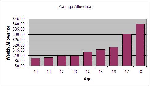
Figure 13
To extend this exercise further, have students ask their parents, older siblings, aunts, uncles, or grandparents if they remember how much money they received each week for an allowance. Then have students use the CNN Money web site to calculate the inflation adjusted value of their historic allowance (http://cgi.money.cnn.com/tools/allowance/allowance_101.html.)
It is eye-opening for many students (and parents) to see that the $ 5 per week allowance they received in 1975 is worth almost $ 20 today. This site also provides the annual increase each year. This data can be graphed for further analysis and understanding of how the value of money changes over time.
Wrap Up
: At this point in the discussion, it would be a good idea to have students make a list of the properties found in well-designed graphs. Some examples can be found below:
-
· Scale, interval and range should be appropriate for the data. If possible, the scale should start at 0, or should indicate otherwise, and the range shown should include the entire data set, without an excess amount of blank space. Intervals should be small enough to clearly show the data distribution, if not distributed in a normal bell curve.
-
· Graphical elements, such as pictures, axes, titles, grid lines, and other graphics should not overwhelm the data.
-
· The data should be graphed using an appropriate graph type. Circle graphs or pie charts are good for showing parts to a whole, bar graphs are appropriate for comparing distinct data sets, and a line chart is most often used for showing data changes over time.
-
· If any data or graph element is ambiguous, include text or data tables to provide greater detail.
-
· Clearly label the axes, tick marks, unit of measure, time frame, and always provide a title on the graph.
-
· Avoid, two-dimensional growth, unnecessary pictures, shading or attempts at perspective.
Final Project/Assessment
The unit concludes with a small team project. This project will entail analyzing a set of data and then creating a presentation to support a particular point of view. Students will be divided into opposing sides so that each team will support one side of a position in the best way possible, using all of the techniques they have learned to prove a point, or mislead the viewer. Students ay use a variety of topics which could include data on high school graduation rates, stock prices, or political polling data.
Each opposing team will then make their presentation to the entire class and students will have the opportunity to question their opponents as to the validity of the techniques used to analyze their data sets. Finally, each team will also provide a final written analysis of their opponent’s presentation, highlighting areas of deception or questionable procedures.
A great example of data which may be used for the final project can be found on the web site from the Center for Disease Control. (http://www.cdc.gov/HealthyYouth/states/index.htm.) This site has data and statistics on a number of issues which might be pertinent to students including state by state on physical activity, television watching behavior, use of computers, tobacco and alcohol use and more. The site even provides the capability to create comparison tables of two states to compare these statistics. Students can be broken up into groups by state and use the data to prove which state has “healthier” children.
Another possible dataset to use for this comparison is state by state PSAT data, which is also readily available on-line. The College Board publishes state by state results for juniors who take the PSATs. (http://professionals.collegeboard.com/data-reports-research/psat/archived/2000/jrs) Students can use this on-line data to compare states to one another to determine which is the “smarter” state. Since this data is provides scores for verbal, math and writing, students will need to decide how to use the three sets of data to prove their point.