Heidi A. Everett-Cacopardo
The first part of this unit is intended to reintroduce data tables and graphical displays in conjunction with the district standards that require the students to develop scientific numeracy skills. To be scientifically literate, a student must be able to generate data tables and analyze them appropriately through the construction of a graphical display.
The students have certainly received training in graphing before they enter my class as sophomores. However, accessing their prior knowledge and correcting misconceptions concerning analyzing data through graphical displays are important places to start at the beginning of the school year.
The second portion of the unit is devoted to using the students’ graphing skills in analyzing the effect of HIV/AIDS on developed and underdeveloped countries. I will begin this section of the unit devoted to analyzing HIV/AIDS statistics with a review of the data analysis skills that are covered at the beginning of the year in science courses. The students will recall the portion of the unit devoted to the foundational principles of transforming quantitative information into appropriate graphical displays from the beginning of the year. The students will evaluate various data sets on HIV/AIDS and decide what type of graph they should be employed to appropriately display the data.
The students should be familiar with constructing the classic line and bar graphs, but often have difficulty in determining where they should place the variables on the graph and the importance of an equally divided scale. The other major goal for the unit devoted to graphing is developing the students’ confidence in determining which type of graph is appropriate to use for a certain data set. I originally intended to do more an exploration of the various types of graphs and their appropriate application; however, the unit is built around the population pyramid STS task that takes place later in the school year. I have decided due to time constraints to focus on pie charts, map charts or choropleths, stacked bar graphs, bar graphs, and line graphs as the main graphical displays. These graphs will be used in the second part of the unit on HIV. I will briefly discuss scatter plots and how they are made but will not use them in the first section of the unit on graphing.
The first section of the unit dealing with graphing will also include a basic introduction on using a spreadsheet software program for analyzing data and creating graphs. The business department does cover the use of spreadsheet software programs in their computer courses from freshman. I will activate the students’ prior knowledge about manipulating data in a spreadsheet program using a systematic tutorial that I have included in my appendix under lesson plans.
Some of my students are health science majors others are business majors due to the schools’ dual magnet themes. Analyzing data and depicting data appropriately is a skill used by both scientists and businesspersons. Graphical depictions can mislead the viewer. Whether the students have the goal of going into science or business each one should have, the ability to recognize when information is misleading and leads to drawing an invalid conclusion. An informed citizen should be able to analyze a graph and detect flaws with the way in which the information is being presented. The students will compare and contrast various types of graphs and determine what quantitative information is appropriately displayed in each type of graph. Special emphasis will be placed on building the students’ skill to analyze poorly constructed graphical displays that may mislead visually.
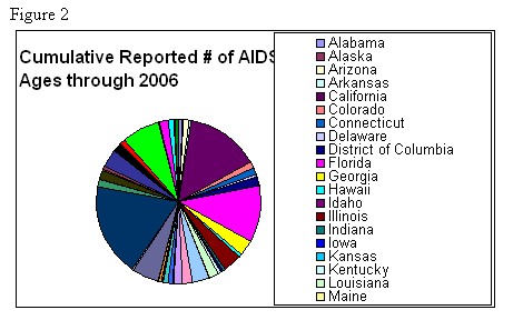
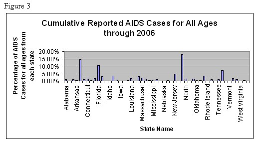
The students will apply their knowledge of graphics by being provided with various graphical displays that include both “good” and “bad” graphs. The students will determine if the rules of using a certain graph have been followed and if the graphs are misleading. I have included links to bad graphs (see website #1) and good graphs (see website #1,2,3) in the appendix section of my unit under teacher resources. I recommend finding “bad” graphs online to reinforce the point that not everything on the web is “good.” I have created poor graphs using spreadsheet software that can be accessed by going to the teacher resource section. The examples I have created are a pie graph (Fig. 2) using all fifty states and their percentage of the AIDS cases each state has out of the entire AIDS cases for the entire country. Pie graphs should only contain a maximum of eight groups in order to allow for appropriate visual distinction between the slices. I have also included a bar graph (Fig. 3) using the same data on cumulative number of HIV cases in all 50 states. The bar graph does not provide for easy distinction between the various states and the legend cannot fit on the page due to the number of states. The data used to make the bar graph below is from the CDC, HIV/AIDS Surveillance Report: Cases of HIV Infection and AIDS in the United States, 2006, National Center for HIV, STD, and TB Prevention, Centers for Disease Control and Prevention, Department of Health and Human Services, 2008. The Kaiser Family Foundation supports the web page www.statehealthfacts.org. This website provided the data below in downloadable spreadsheet format that allowed for my graphical display using a spreadsheet software program.


The second half of this unit aligns with the science, technology, and society task that is covered during the latter part of the unit. The students will call upon the graphing unit that was introduced to them at the beginning of the year as they are introduced to population pyramids. The students will develop their skills in analyzing the growth patterns of human populations using population pyramids provided by the Center of Disease Control and Prevention and then distinguish between a developed and underdeveloped country of their choice from the database containing population pyramids.
Science is fueled by data acquisition and in order to narrow the topic the students will examine data related to factors that influence the incidence and prevalence of infectious diseases affecting the growth of human populations. In the second portion of the unit, the students will recall their knowledge of genetics by reviewing dominant versus recessive traits. The students will collect data on the phenotypes of the individuals in the classroom that have either a dominant or recessive trait. The class data will reflect a sample population and the students will then transform their data into an appropriate graphical display recalling the various graphics we discussed from the first section on graphing. The following are a list of some classic dominant traits that I would use with the class.
-
1. Unattached earlobes are dominant to attached earlobes.
-
2. A hairline with a widow’s peak (my students call this an “eddy”) is dominant over a continuous hairline.
-
3. Mid-digit hair on the middle portions of your fingers is dominant over having no mid-digital hair at all.
-
4. Rolling your tongue into a tube is dominant to not being able to roll your tongue.
-
5. Clasping your hands naturally and having your left thumb rest on top of your right thumb is dominant to right thumb over left.
-
6. The distal end of your pinky bending in towards the ring finger when placing your hands at rest on a table is dominant over a pinky that stays straight (Starr, 2004).
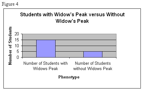
Students will utilize and enhance their skills in generating a bar and a line graph using the class data. The students will then be introduced to software programs that are capable of generating graphical displays. There are a variety of spreadsheet software programs capable of generating charts. The ability to manipulate data through a spreadsheet program is an essential skill that all students should have mastered in order to be fully prepared for the demands of a liberal arts or technical college. Below I have provided an example of a bar graph (Fig. 4) that I generated by entering fictional data on dominant versus recessive traits in a spreadsheet program.

This unit is intended to meet the requirements for biology students at the high school level, but parts of the unit could readily be used at the middle school level as well in other disciplines such as math, business, and psychology. Many computers have a spreadsheet programs installed along with their main word processing programs. I suggest that if you are unfamiliar with the program offered on the computers in your building that you contact your Information Technology personnel for a tutorial or request a professional development seminar on the subject. The ability to manipulate data within a spreadsheet is a critical skill for both the educator and student in the age of data analysis to assess student learning and the success of a school. The spreadsheet program is a critical piece of this unit, as it will be used in throughout the unit to generate graphical displays.
The second part of the unit will focus on the students investigating the factors related to HIV/AIDS that affect the growth of human populations. The science, technology, and society (STS) task from the state requires students to analyze population pyramids representing human populations from developed and underdeveloped countries. The students are asked to compare and contrast these pyramids and determine what factors contribute to the difference in the demographics and growth of each country. This STS task also requires students to analyze population pyramids representing the populations in twenty years. The unit I have developed is intended to broaden the investigation. This unit also aligns with a previous unit I have written on infectious diseases with an emphasis on viral infections.
The second portion of the unit is intended to begin after the students have completed the state STS task on population pyramids. Once the students have practiced collecting data on their class concerning dominant and recessive traits and choosing the appropriate graph to depict the class data, the students will be reintroduced to the STS task on population pyramids. The students will review the how to analyze a population pyramid and the distinct shape a developed country has versus an underdeveloped country. The students will then choose a developed and underdeveloped country to research the effect that HIV/AIDS has on these countries. Infectious diseases always hold the attention of the students as they are always curious about their health and the various “facts” they believe about the transmission and prevention of more notable infectious diseases. All of humanity is linked in their ability to understand pain and suffering that comes from an infectious disease.
There are many pros and the cons to globalization. The advent of globalization has provided a highway for infectious diseases to travel from country to country. Infectious diseases are capable of spreading to many more populations due to the increased air travel. I want the students to understand that as they research two different countries that may be thousands of miles apart; these countries can easily be linked globally through the ease of traveling by air.
The students will then choose several factors (such as access to healthcare, access to contraceptives, drugs/treatments, and clean water) contributing to the transmission and prevention of HIV/AIDS affecting the growth of a developed and underdeveloped population. The students will use various credible Internet resources such as the World Health Organization, Center for Disease Control, and the United Nations to collect data on their chosen countries. Research on the Internet will provide the students with data related to factors contributing to the transmission and prevention of HIV/AIDS affecting the countries they have chosen to investigate. There have been many gains in the health field in concerning biotechnology and computer technology. These technological advances have allowed for greater access to data monitoring the health of human populations around the world. The students will develop graphical displays of the data using a spreadsheet software program. The students will then compare their graphs with the population pyramids of their countries. The students will compare and contrast how the data are related to population pyramids provided by the U.S. Census Bureau International Database. The students will present their findings to the class through a computer-generated presentation.