Ashley R. Singer
It is a good idea to check students' prior knowledge with a work sheet based on skills needed to be successful in this unit.
Comparing, ordering, rounding and place value are important concepts when interpreting data. Place values of larger numbers can also be useful in interpreting data, especially if discussing national and world data.
A teacher should also check to see if students are able to read simple tables and graphs before they are expected to create their own data display. A good graph to interpret could be a bar graph with a simple scale, such as counting by 10's.
Lesson 1: Samples and Surveys
Objective: Students recognize biased samples and identify sampling methods.
Vocabulary: population, sample, biased sample, random sample, systematic sample, and stratified sample
Introduction: An environmental awareness magazine printed the results of a survey. Statements 1, 2, and 3 are different interpretations of the data collected. Which one do you think you are more likely to read in the magazine?
-
1. The average American recycles when it's convenient, but won't go out of his or her way to find a recycling receptacle.
-
2. The average reader of this magazine recycles when it's convenient, but won't go out of his or her way to find a recycling receptacle.
-
3. The average reader of the magazine who responded to this survey recycles when it's convenient, but won't go out of his or her way to find a recycling receptacle.
Discuss the realistic interpretation (1) and why a magazine would print it as opposed to printing the more true interpretation (3). The information seems like a bigger deal in interpretation 1 while interpretation 3 sounds very wordy.
Ask students who can actually answer the magazine's survey? Possible answers are: Americans, magazine readers, or anyone who wants to. The correct answer is: anyone who subscribes to the magazine or buys it at a news stand that month. Say "this group of people is the population."
Ask students if they think everyone who reads the magazine actually responds to the survey. Answer: no. Say "this group is called the sample". In statement 1, the population is all Americans and the sample is readers of the environmental awareness magazine who actually responded. This is a biased sample because it is not a good representation of the population.
Example 1: Identifying Biased Samples
Identify the population and sample. Give any reasons why the sample could be biased.
A scientist living in a coastal community chooses 2000 people out of the phone book to survey about whether or not they take precautionary measure to ensure they are not dumping any harmful chemicals, such as cleaners, down the drains or into sewers.
Population: People living in the costal community
Sample: 2000 people who take the survey
Possible biases: Not all people are in the phone book, people living on the coast may be more likely to think about what they are dumping in the drains as opposed to someone living inland that doesn't think much about where harmful chemicals can end up.
Ask students what they think might be the best way to take a survey with least amount of bias. Correct answer: randomly choosing people to survey. This is called a random sample. This method is the best because every member of the population has an equal chance of being chosen. Random sampling is not always the most convenient method so other methods are sometimes chosen.
Random: By chance
Systematic: According to a rule or formula
Stratified: At random from randomly chosen subgroups
Example 2: Identifying Sampling Methods
-
A. In a city wide survey, 3 neighborhoods are chosen and 25 people are randomly chosen from each neighborhood to answer the question of whether or not they buy locally produced food and products.
-
Answer: Stratified, the 3 neighborhoods are the random subgroups and people are chosen randomly from within those neighborhoods.
-
B. An exit poll is taken of every third student leaving the auditorium. The question asked is do you get dropped off at school by a parent or drive a car yourself, or do you take the school bus, walk, or take the city bus?
-
Answer: Systematic, the rule is to ask every third student.
-
C. All the teachers in New Haven enter their names in a drawing for a chance to chaperone students to the Connecticut Science Center to view the Energy City exhibit. Ten teachers' names are drawn.
Answer: Random, names are chosen by chance.
Closure: Think of a question you would want to be answered about what or why students eat on an hourly, daily, or weekly basis. Choose your population: students in this classroom, all the freshmen, the entire student body. Decide a way to choose your sample from the three sampling methods. Your survey should be as unbiased as possible.
Have students write their answers on an index card and use as an exit sheet.
Homework: Find an article about a survey in the newspaper or a magazine, identify the population and sample. Decide if the survey taken was biased in anyway; if so, come up with suggestions about how to change the survey to make it unbiased.
Lesson 2: Measures of Central Tendency
Objective: Students find measures of central tendency.
Vocabulary: Mean, Median, Mode, and Outlier
Introduction: Ask students what these words mean: measures, central and tendency. Acceptable answers for 'measure' are: a way to tell someone how long or how big something is by using feet, inches, meters, pounds. An acceptable answer for 'central' is: in the middle. Acceptable answers for 'tendency' are: habits, common, and happens a lot. Tell students a measure of central tendency is a way to describe a lot of data with one number. This number represents the middle of the data.
Students have already done work with measures of central tendency, but did not use this vocabulary. Common mistakes are: students often want to use the word average and find the range; it is important to steer them to use the new vocabulary and tell them the range is not something we will be looking for today.
Find the Mean, Median and Mode.
Discuss the numbers. Ask students if they see anything or any state that stands out. Correct answer: New York. Explain that New York is a large state, and they have Niagara Falls for Hydro Electric Energy. Tell students this is called an outlier because it is so far away from the rest of the data. An outlier can throw off the mean of a data set.
North Eastern Energy Consumption Estimates-2007 (U.S. Department of Energy)
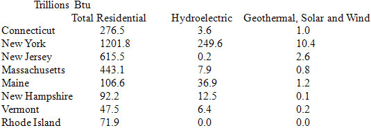
Discuss the findings:
Total Residential: mean: 356.9, median: 191.6, mode: no mode
Hydroelectric: mean: 39.6, median: 7.2, mode: no mode
Geothermal, Solar and Wind: mean: 2.0, median: 0.9, mode: no mode
Closure: Students should notice that some of the numbers are very different and in some cases the measurements can be misleading such as the case of the mean of 39.6 for hydroelectric power. Maine is the only state close to the mean; New York throws of the mean because it is an outlier. Students can also be asked to compare the total residential figures that include the non-renewable resources with the figures of the renewable resources.
Homework: Students will be sent home with similar data about another group of states such as the west coast or a group of southern states and a map of the Unites States with the states labeled so students can see the size of the state. Students will answer questions such as: Are there any outliers? How did this affect the data? Why was there an outlier? For example, New York gets hydroelectric power from Niagara Falls. Do you think this data table will begin to change as time goes on? What evidence have you seen in New Haven to back this up?
Lesson 3: Displaying Data (2 days)
Vocabulary: Bar Graph, frequency table, histogram, line graph
Introduction: Begin by talking about the previous day's lesson. We found a bunch of numbers! Did they look good written on your papers? Did the way they were written tell us anything about them? Do you think there is a way to show data that looks good but also tells us something about the information? Most students have been exposed to various types of graphs and will answer yes. This is a chance to find out what students already know.
Bar graphs are often used to show information that can be grouped. If the data are shown in a list, it is a good idea to start with a frequency table. A frequency table tells how many times a certain piece of data has happened.
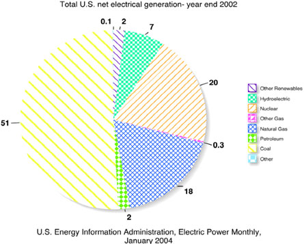
Students will use total U.S. net electrical generation (2002) 304 billion kilowatt-hours (kWh) and Total energy supply 97.551 Quadrillion British thermal units (Btu) to convert percents given in pie charts into kWh and Btu to be graphed on a bar graph.
Example of a bar graph:
A histogram looks much like a bar graph except the bars are touching. The bars touch because a histogram shows intervals in which data are grouped.
This part of the lesson is a good chance for students to collect some of their own data. Have students create a list of their favorite junk foods and drinks. Then ask them to tally up the amount of wrappers, paper or plastic cups, cans (aluminum), glass and plastic bags they estimate themselves to use in a week. Allow students to subtract what they recycle regularly. Next make a frequency table on the board for all students to see. Decide on an appropriate interval. Create a class histogram and label it: Garbage we make that will be here long after we're gone. Hopefully, this graphic representation will promote class discussion; take time to talk about how much garbage this is in a year, and how much of a difference we could make as a class/school if we all recycled everything we could.
Students should be given time to calculate their own carbon footprint. Have students go to www.nature.org to generate individual, accurate carbon footprints.
A line graph shows trends and can be used to make estimates for information in between data points or predictions about future information. Create line graphs using total energy usage created by wind, solar, geothermal, and hydroelectric power over the past 10 years. Estimate the energy usage for future years: 5, 10 and 15 years away from now.
Example of a line graph:
Closure: Open a discussion about whether or not students think this is going to be enough or if they think we will be in trouble as a global community. Remind students to think about the growing population, more people will mean more energy demand.
Homework: Students will take personal garbage generation data home and create an individual histogram. This Histogram will be presented with the student's personal carbon footprint.
Lesson 4: Scatter Plots
Vocabulary: Scatter plot, correlation, line of best fit
Introduction: Give students a packet of data containing the populations of all countries and the total carbon emissions for each one. Depending on the level of the students, have them look up the country's data or give them the data to be graphed. The best counties to use in this example are Brazil, China, India, Mexico, Nigeria, and The Unites States. Graphs should have population on the X-axis and carbon emissions on the Y-axis. Have students graph coordinates.
Now that students have a graph with coordinates completed, begin to talk about a pattern they may see. Students should notice that the higher the population the higher the carbon emissions are for the country. Give the definition of correlation.
After students have had a chance to discuss patterns and correlation, give them a ruler and tell them to put the ruler in a place that they think is the average of all their graphed information. The ruler should be in a place that follows the correlation of the data and has a few points on top and below the ruler. Have students trace the line they think works the best. This line is called the line of best fit. Students should be given a few moments to compare their line with the lines of the students around them. Students will also notice a difference between their lines and the others. Let students know this is acceptable and this line is an estimate with many possible correct answers.
Assessment: Ask students to do the same process, using the same countries but this time they will be comparing water usage. Compare this scatter plot with the scatter plot about carbon emissions. Lead a discussion on the patterns and outliers they see.
Closure: Ask students what they do to be wasteful of energy and water. Ask if there are ways they can conserve at home.
Data can be found at www.cia.gov (accessed 7/6/10), www.nationmaster.com (accessed 7/6/10) and, www.worldwater.org (accessed 7/6/10).