Kathleen Z. Rooney
Rather than discrete lessons, this unit will be integrated throughout the curriculum, with much of it providing an opportunity for students to do independent work. During each phase, students will divide into working groups in order to research and brainstorm models that will inform the entire class. At the close of each phase, conference style presentations will enable students to share work with their student colleagues.
Students will need to grapple with these quantitative representations holistically as well as specifically. In turn, this will provide the deep analytical practice needed to succeed in statistics.
Phase 1 – How are data collected and interpreted?
Asthma distributions
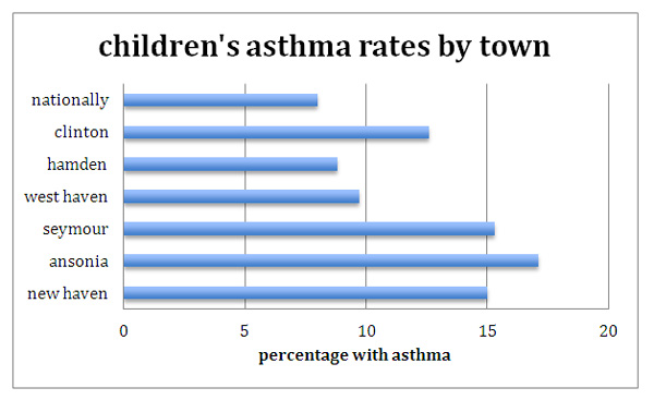
In the beginning of the course, as students develop the skills to interpret graphs and describe distributions, we will look at the most recent state fact sheet on asthma. These graphs will allow students to practice interpretive skills. We can read the introduction to the state air pollution surveillance document and discuss the method of data collection. Students will begin to notice the disparity in the level of disease in their city, when compared with the rest of the state. Together we will begin to ask, "Why?"
An initial task for students is to graph comparisons between their town and another town to compare asthma rates. Using the state surveillance data, students can select their own town and one or more others to compare. Students can present their comparative graphs and the class will discuss how the displays illustrate the information.
Attention will be given to appropriate type of graph, identification of population, sample, variables, and method of data collection. Graph must have appropriate intervals and labels.

Diseases of the lung are naturally connected to the quality of air we breathe. We can then seek out and find statistics on pollution, including particle pollution. From the initial indications of the statistics, students will begin to develop an awareness of the pollution problem within the city. Students may want to believe that the associations they see indicate causation, and we can discuss the appropriate cautions there. Again, this is the place to look at various data displays and to again ask questions about data collection.
Pollution distributions
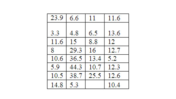
At this point, an interesting assignment would be to task students with describing a distribution of PM 2.5. Using the same distribution, one group of students should experiment with summary statistics that appear to maximize the PM. Another group can attempt to minimize the PM 2.5 in their summary. Statistics to use could include hourly, daily weekly, monthly and annual means, or mean versus median, or distributions with and without extreme points included. Student groups should display their statistics and discuss the potential parties who would have an interest in one set of statistics versus another set.
Why is the mean higher than the median? Is this a skewed or symmetrical distribution? Would someone with asthma want to know the mean or median to be assured of greater protection? Would a nearby polluter want to report the mean or median? Which values in the distribution are out of compliance with federal guidelines?
Which values have the greatest influence on the mean?
Daily recordings of PM 2.5, New Haven, January 2009 in
Μg
/
m
3

We can look at simple measures of center for this distribution and analyze:
mean 14.56
median 11.6
These types of investigative questions and the ability that students have to manipulate the representations of the data with graphics and statistics, make these simple tasks much deeper. In statistics we need to refocus students away from looking for the "right answer." The math here is about modeling a problem, not providing a solution.
Quantifying the rate of exposure
Once students have examined more than one statistic from a distribution, they may be more confident to describe the distribution of pollution in New Haven. In order to quantify their own exposure to particulates, students quantify the weight of particles inhaled annually.
EX. (PM weight/m3 of air)(volume inhaled of air per respiration) (number of respirations/min)(min/yr)=weight/yr
NEW HAVEN:
(10
Μg
/
m
3
(.005
m
3
per respiration )( 15 respirations/min )(525,600 min/yr)= 394.200
Μg/yr
about .4 g of particulates a year
LITCHFIELD:
(5.4
Μg
/
m
3
)(.005
m
3
per respiration )( 15 respirations/min )(525600 min/yr)= 394200
Μg/yr
or about .2 g of particulates a year
Students can see that a twofold increase in pollution translates in to twice as much actual weight of inhaled particulates a year. This notion of calculating the actual weight helps students to make tangible this notion of such a finely dispersed pollution.
Phase 2 - Models for evaluating risk
Students will use probability models to predict a random student's potential exposure to pollutants. These would be combinations of probabilities that have been defined by the students based in their prior research. These will be used to predict the length of bus rides for students, to calculate their exposure to pollutants based on the detected levels of PM on the bus, the duration of rides and their likelihood to be at special risk for health loss.
For example we know that a student has about a 90% chance of being a bus rider and a 15% chance of having asthma. If we think that these events are independent, then the probability of being on the bus and at risk for health affects of high PM is multiplied: (.9)(.15)=.135. Thirteen to fourteen percent of school children in New Haven are at risk for health complications due to PM exposure. That translates to about 2700 children in New Haven.
Our effort will be to build a probability model of exposure, not to prove causation. The question about causation, linking specific pollutants with human health effects, is outside of the scope of our investigation and it is already extremely well researched and documented. We can be sure that the level of pollutants in the air that New Haven residents breathe is elevated. That is true when compared not only to her neighboring communities, but also in comparison to federal health standards.
If we think that 2700 students are at risk, then how big is that risk? The amount of additional exposure to particulates during the school bus commute depends on how long that commute is. Based on the random nature of school assignment and records of applications, students could create a simulation to build a probability distribution that reflects the likelihood of hours spent commuting per week. The expected value of this commute could allow students to quantify the average annual additional burden of inhaled particulates based on the bus rides.
Simulation
An example of simulation might be this:
Students can look at two maps of the city
School district Map
Census Tract Map
Using this information we see there are 29 census tracts in New Haven.
We will use simulation to model 25% randomization and 100% randomization.
Number 145 cards, 5 cards with each value between 1 and 29
The cards represent 5 children from each of the 29 census tracts
100% randomization
New Haven has about 28 elementary schools. We will simulate 100% randomized assignments by shuffling and dealing the cards onto a list of schools.
Collecting Data
Compiling the data using the school district maps. Students can physically measure the distances on the map or use an interactive online tool like Google maps.
Students will choose an endpoint in the center of the census tract. We will mark the centers of each tract. With each card we will use the endpoint of the census tract and measure the distance to the assigned school.
Analyzing the data
Students will have written the distance for bus rides for each student on each card. An average distance can be computed.
A 25% simulation would be similar, every 4th card is assigned to a magnet school and the rest are dealt into a neighborhood school pile. The magnet school children will have their commute measured just like the first simulation. The neighborhood children will be placed in the closest school to the center of their census tract. If the distance in 1 mile mark the card WALK. We can collect average bus ride length and percentage of bus riders. This should model the current situation of bus ridership in New Haven, as about one quarter attend magnet schools, however the transportation department reports a 76-86% statistic of bus ridership.
The additional burdens of the school bus rides will likely be significant. Studies of current technology buses show significant elevation. Particulate averages of 20
Μg
/
m
3
were found on the Washington State bus runs. Other studies showed particulate levels as low as 21 in Ann Arbor and as high as 163 in Chicago.
20
The study of short-term exposure showed a mounting airway response per 10
Μg
/
m
3
A short ride on a bus with 160
Μg
/
m
3
could be very risky.
Phase 3 – Alternatives
After looking at the simulation for totally randomizing school attendance (with no regard for geography), we can simulate school assignments by neighborhood and calculate the percentage who can walk to school. We can rework our calculations for exposure and miles traveled based on these lower bus riding rates. For example, if only 10% ride a bus, the probability of increased risk drops to (0.1)(0.15)=(0.015) This multiplied by 20100 students = 302 students, a reduction of 2,400 students at highest risk.
Students can add value to their calculations by contrasting health care costs, fuel costs and the difference in over all emissions from school buses between the neighborhood model and the randomized model. For example, the school system currently runs 268 buses fairly continuously from 6:30-9:30 each morning and 1:30-4:30 each afternoon. Using the quantitative tools at the United States Department of Transportation, students can quantify diesel output, and cost of fuels. Using state and federal websites, students can quantify healthcare cost, and lost school days per student at high risk.