Kathleen Z. Rooney
Lesson 1
Objectives
|
°¤
|
Interpret several types of tables and charts with data about our target diseases. Read historical information about the diseases. Create a profile of the disease including symptoms as well as outcomes of these illnesses and describes the pathogen that causes the illness.
|
|
°¤
|
Shape a targeted question for further research. Identify variables and populations to be examined in order to answer these questions.
|
Strategy
Students will work in groups. Using the indicated websites and/or packet of information about Lyme and WNV, students will use the following questions as prompts, to discuss what areas of interest they have for further study around this disease.
-
Are you at risk for catching this?
-
How sick will you/can you become from this illness?
-
Are there deaths in CT attributed to this disease?
-
What precautions would you be able to follow to avoid catching this disease?
-
How does where you live affect your chances for getting this disease?
-
What kind of information would you need to answer these questions?
-
Who is tracking this disease?
-
Is the rate of infections increasing or decreasing?
Students should discuss the research material and prepare a group question, or topic for further exploration. A written response should be prepared that includes the following outline:
|
1.
|
A list of symptoms and outcomes for humans infected with Lyme or West Nile Virus
|
|
2.
|
A list of risk factors for becoming ill from this pathogen.
|
|
3.
|
A question that you intend to research further related to this illness.
|
Groups should present their work to the class and the class should open up to discussion.
Prompts for class discussion during presentations
What will you measure to find out? The quality you choose to measure is a variable.
Who will you look at in order to measure that quality above. This is your population.
Why measure that population?
When will you measure them (in all contexts or only a specific one)?
Where is the population?
Are there agencies studying this that you could look to for your information?
Discuss the importance of context to attach meaning to numbers in order to know how to correctly interpret the numerical information on the retrieved (or teacher-provided) charts.
Numbers in context:
Value or quantity
Nominal : Numbers can be names such as a passcode/phone number/upc code
Ordinal : place on a wait list, batting order, class rank
A nominal code sometimes includes order, ex.room number in a building
Frequency: the number of occurrences. This is tricky when it is the frequency of a value.
Ex. In a deck of cards there are 4 10's. 4 is the frequency, 10 is the value.
Lesson 4
Prior knowledge
Students will look at univariate data in Lessons 1, 2 and 3. They will discuss ways to display and compare data with an emphasis on measures of center and spread. There will be discussions and comparisons of skewed and symmetric distributions. Students will discuss outliers and their effect on a distribution.
Objectives
-
Using the univariate data previously examined and the life cycle drawing from 1.3, suggest a hypothetical relationship between increase or decrease of disease rates and environmental factors. For example students could propose that tick and mosquito rates are responsive to changes in rainfall or deer populations.
-
Collect data from primary sources (government websites/weather almanacs) that pairs the variables in your hypothesis.
-
Create a scatterplot with x and f(x) axis, and the paired data points (x,f(x)).
Strategy
Students will use previously prepared charts depicting the life cycle of their pathogen of concern. Through online, or resource research, students will identify factors that can create pressure in favor or against populations of organisms in the vector cycle. Students will identify specific populations and variables to examine (x) (for example: rainfall) and will collect data about the variable's effect on disease rates or populations of organisms [f(x)]. Students will collect data and create a scatterplot using an x, f(x) coordinate plane. Students will present their findings and explain the relationship they have chosen to graph.
Prompts for class discussion during research and presentations
-
What environmental factors affect the creatures in the life cycle of Lyme?
-
How might we determine if these factors are related to disease rates?
-
Do infection rates tell us anything about the environments in which these diseases thrive?
-
What can we infer about the relative prevalence of these diseases based on geography? Based on year?
-
What does the shape of your graph suggest about the relationship between your x-variable and the f(x) variable?
Bivariate data is a pairing of quantitative data. We can use a visual strategy of plotting the intersection of these pairs and examining their spatial distribution for a pattern.
Lesson 5
Objectives
|
°¤
|
Manually fit a line of best fit. Discuss the slope and approximate fit of the data points and write a descriptive model that includes the hypothesis, research and the mathematical graphic.
|
Strategy
Students should find the mean of the x values (mean of x) and mean of the f(x), (mean of f(x)) values and mark the point (mean of x, mean of f(x)) on their scatterplot. Using this point as a pivot point, students should work in their groups to decide on a "line of best fit". Alternative ways to model the data as a line should be discussed. Students may propose more than one such line.
Prompts for class discussion during presentations
-
What shape is suggested by each graph?
-
What do you think this means about the variables you are examining?
-
What line would you draw to connect this data? Recall that slope means vertical change divided by horizontal change. What slope describes this data the best? Students should compare methodology of drawing a line of best fit.
-
What is an actual dependent result f(x) from the data? Using the same x, what is f(x) predicted by the line we drew?
-
What is the difference between the f(x) value predicted on your line: f
^
(x) and the actual f(x) ? This is (f(x) -f
^
(x)) or residual. It is the measurement of the amount that our model missed.
Students should try to interpolate a data point. To interpolate means to look at an x value point that is not a member of the data set but falls within the range of the observed data. Using the line of best fit and that x-value, predict an expected f(x)-outcome. Each student should prepare a written report based on the group data. The report should be a verbal description of a model illuminated by the scatterplot and/or the line of best fit. Students should draw conclusions about this relationship based on the research, as well as the linearity of their results. They should also discuss the data sets for outliers or unusual points.
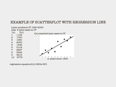
Figure 4: An example of a scatterplot from CDC Lyme data with regression line
14
Lessons 6-8
Continuing with the exploration model, students will learn how to find a regression equation on the calculator, and how to read the values for correlation. Emphasis will be on looking at slopes and comparing trends for accuracy. Outliers and/or influential points will be examined and discussed. Correlation values will be used to evaluate how well the data fits the line. Residuals will be examined in the calculator and discussed in terms of the graph. Students will spiral back to the questions raised in lesson 5 about the differences between observed and expected values using the line of best fit and relate these to residuals. Cautions about inference from the regression will be discussed.
Summative Assessment
A final report will be written that includes information the vector cycle and life cycle of the disease agent. Also included will be previous writings about the group's question, hypothesis, data, mathematical model and graphical models. Conclusions about correlation should also be included. Recommendations based on the investigation should be written with an eye toward personal safety and or/public policy that could result in reduction of infections in the future.