Lesson 1 -- Univariate Data Classification and Descriptive Statistics
Introduction
Prior to this introductory lesson, students should know the definition of data, and be familiar with some environmental and economical aspects that affect living, for example income, income source, geography, weather. This lesson poses the main question: How will we survive? This question, and the many answers that it may have, is relevant to the students as they become independent from their parents and have to fend for themselves in a world offering little compromise when it comes to household economics. This lesson provides the basis for future learning about data display interpretation, particularly central tendency and variability or dispersion (spread).
Objectives - students will be able to
-
1. Classify data as nominal, ordinal, interval, ratio (without graphics)
-
2. Give examples of each of these data types.
-
3. Calculate descriptive statistics for univariate data sets
-
4. Interpret frequency tables and distributions
Strategy
The teacher should provide some examples of data sets that relate to the general categories chosen by the students, and provide definitions of the main data types, and give examples of different units used to measure the same variables. Looking at populations of very different sizes may be useful to exemplify the use of different units. Prompt students to recall any formulas and terminology about descriptive statistics.
Student task
-
1. Use the internet or an almanac to find univariate data sets (without graphics) for weather data, water data, and food data, energy data, housing
8
.
-
2. Identify the variables and classify them
9
.
-
3. Calculate one-variable statistics by hand, with calculator, and with spreadsheet software: mean, median, mode, range, quartiles, IQR.
-
4. Discuss possible reasons and implications for the calculated descriptive statistics, e.g. which countries have a gasoline price above the mean, etc.
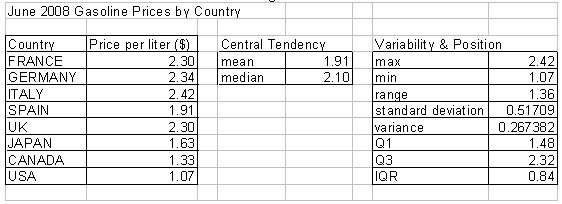
Figure 1 contains an example of a simple data table and some descriptive statistics.
10
Figure 1
Discussion and Assessment Questions
Discussion and assessment prompts and sample response are included in the next few paragraphs. Students may be expected to discuss or answer some of the following questions. The teacher may decide which questions are used for discussion and which are for assessment.
For nominal data, the teacher could ask “What type of data are the food groups?”, “What are the basic household cost categories?” Possible responses include the following: rent, mortgage, food, water, electricity, oil, gas, other.
For ordinal data, the teacher could ask “In what way can households, communities and nations be ranked (ordered)?” Some possible responses include family (population) size, area (land size)
For interval data, the teacher could ask “How do we measure the date”, “How is temperature measured?” The first question could stimulate a discussion about an interval or unit of a “one day”. Interval units of temperature measurement include degrees F, C.
For ratio data, the teacher could ask “How are elevation and depth measured?”, “How are savings and debt measured? “How is temperature measured?”, “What does t = 0 mean if t describes time?”, “What would a negative value for t mean?”
Many sets of ratio data include both positive and negative numbers. A ratio measure of temperature is the Kelvin scale; this could stimulate a conversation about absolute zero.
Lesson 2 -- Univariate Graphical Analysis and Data Classification from Graphics
Introduction
In this lesson, students search for graphical displays of their chosen environmental and economic factors. Then, students describe the types of data displayed in the graphics. Finally, students describe and interpret distribution shapes of frequency distributions. These skills will aid students in the creation of graphical displays in the next lesson.
Objectives - students will be able to
-
1. Classify data sets as univariate or bivariate from a graphic, identify data types
-
2. Estimate and discuss measures of center and variability from graphical displays
-
3. Interpret various graphical displays of data using center, spread, clusters, gaps, outliers, other unusual features, shape.
-
4. Describe, analyze and interpret frequency distributions and histograms
Strategy
Teacher should promote students to identify examples of different shapes of distributions, including normal, skewed, and “flat” normal (high and low variability) skewed left and right. The teacher should also provide examples of different types of frequency distributions: Interpreting a stem-and-leaf plot is a good starting point for this lesson, as many students are familiar with this type of display.
Student task
-
1. Use the internet or an almanac to find univariate data sets represented in a graphical format.
-
2. Interpret frequency tables, frequency histograms (using data sets that represent each of the data types).
-
3. Describe the central tendency and spread of a data set for one particular graphic.
-
4. Compare two frequency distributions describing similar parameters for two different populations
11
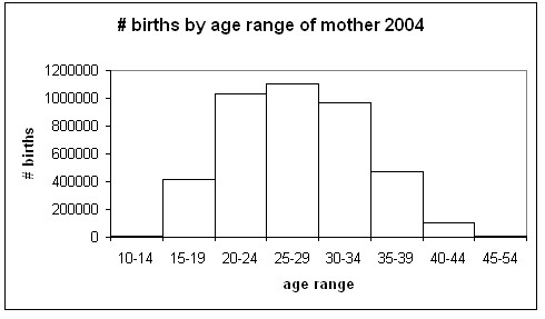
Figure 2 is a sample histogram, showing the numbers of births to selected age ranges of women in the US in 2004.
12
Figure 2
Discussion and Assessment Questions
Using this histogram, or a similar graphic, students will make observations such as the following:
It should be clear by looking at the histogram that most children are born to mothers of ages 25-29. Slightly more children are born to mothers ages 20-24 than of mothers ages 30-34. But since about 100,000 children are born to mothers ages 40-44, the histogram is slightly skewed right. The spread of the data has obvious biological limitations; note the very small number of children born to mothers below 15 or above 44.
Lesson 3 -- Univariate Graphical Analysis and Construction -- Frequency Distribution Types and the Normal Distribution
Introduction
In this lesson, students will continue analyzing graphics describing univariate data sets, and use their analysis skills to interpret and critique peers constructed data displays. The students experience a variety of data representations in this lesson. A more detailed discussion and presentation of distribution types occurs in this lesson. This lesson culminates with a discussion of frequency distribution types, in particular the normal distribution.
Objectives - students will be able to
-
1. Construct graphical displays of univariate categorical data, including dotplots, histograms, cumulative frequency plots, stem and leaf plots, box plots, bar charts, pie charts, frequency tables and distributions
-
2. Describe, analyze, and interpret frequency distributions
-
3. Compare clusters, gaps, outliers, unusual features, shapes of distributions
-
4. Compare distributions using various data representations (table, histogram, stem-and-leaf, box plots)
Strategy
The teacher should present examples of one-variable data that is represented in tables, pie charts, bar graphs, emphasizing the type of data represented in these graphical displays (nominal and quantitative).
Student task
-
1. Graph nominal and quantitative data with pie charts, bar graphs, …
-
2. Graph frequency distributions (by hand, with graphing calculator, graphing software, graphing applets) and relate their shapes to measures of center and spread. Using technology, students should experiment with different class widths.
-
3. Possible extension: Assume normality of population and find standard scores using formula.
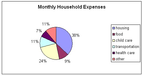
A good exercise for students is to calculate their household or family budget, and then graph the results in a bar graph
13
. Note that the budget is for one month. Figure 3 contains sample output of the Family Budget Calculator while Figure 4 is a possible bar graph representation of the data. Figure 5 is a pie chart of the family budget data. This data might be compared to the U.S. averages household expenses, or another location in the U.S. Students may decide on the other location, perhaps using a location of their favorite sports team or the location of their favorite television show
14
. Obviously, for comparison, the monthly expenses need to be converted into annual expenses or vice-versa.
Figure 3
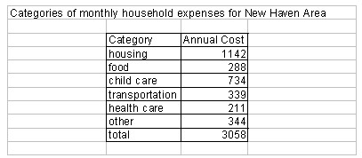
Figure 4
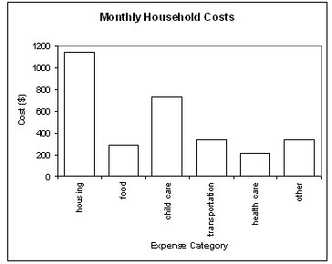
Figure 5
Discussion and Assessment Questions
-
Which distribution is the most “balanced” or “symmetric”?
-
Which distribution has more/less of the data above/below the mean?
-
Which is the largest/smallest household expense category?
Lesson 4 -- Bivariate Graphical Construction and Analysis
Introduction
In this lesson, it is assumed students are familiar with the coordinate plane and know how to graph ordered pairs. The focus will be on creation of bivariate data displays, and the interpretation of these displays. It is also assumed students are familiar with the concepts of slope and linear function. The main focus of this lesson is scatter plots, while lesson 5 focuses on time series plots. Informal (nonalgebraic) interpretation and analysis of a scatterplot, and it’s corresponding trendline, forms the bulk of this lesson.
Objectives - students will be able to
-
1. Represent bivariate quantitative data in a graphical format
-
2. Represent linear trends in bivariate data graphically and algebraically
Strategy
The teacher should provide examples of both time series plots and scatter plots, and have students compare differences between the two. Particular emphasis should be placed on the interpretation of slope, as the change in the dependent variable over the change in the independent variable. Close attention should be paid to the “scaling” used on the axis.
The teacher may begin with time series data, as units whose denominators are time are more easily understood by students, e.g. dollars per hour and miles per hour. Continue with histograms of varying bin sizes or class widths and end with scatter plot of two variables, the units of which students will not be familiar with (e.g. miles per gallon per dollar in the topic of fuel economy). Within linear regression data, start with direct variation, and work toward positive, then negative y-intercepts.
Student task
-
1. Acquire bivariate tabular data about two environmental or economic phenomena.
-
2. Establish hypothesis about the relationship between the two variables.
-
3. Create a scatter plot showing the relationship between the two variables, draw a trend line, interpret the meaning of slope (including units) and y-intercept.
-
4. Verbally describe relationship of variables (a related to b AND b related to a -- concept of inverse function for advanced students).
-
5. Use technology to create scatter plots, and calculate equations of trend lines (include med-med regression), interpolate, extrapolate using equation.
-
6. Verbally describe relationship of two variables, based on data collection, statistics calculation, and graphical construction.
-
7. Peer critique students graphical displays and interpretations.
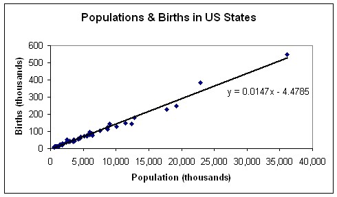
Two variables that can be related using a scatter plot are number of births by state and population by state. In this way, the birth rate may be found for each state, or an average birth rate for the U.S. may be obtained. Figure 8 shows a scatter plot with the least-squares regression line
15
. The method of drawing the regression line varies, depending on the software available, and to some extent, the computer literacy of the students. When comparing data for a specific year or month, especially when the two data sets are found from different sources, it is important for students to make sure that the data reflects the same time period.
Figure 6
Discussion and Assessment Questions
-
What type of data is each graphic displaying?
-
What are the measurement units?
-
How many variables are depicted?
-
What is the relationship between the variables?
-
Is amount increasing or decreasing?
-
What type of correlation exists between the two variables? Positive, negative, linear, strong, weak
Lesson 5 -- Graphical Construction and Interpretation -- Univariate and Bivariate
Introduction
In this lesson, the relationships between economic and environmental variables from one or more areas will be explored and related in depth. The students are allowed to choose which variables they are trying to relate, and these choices should follow their initial topic of interest. This is a good opportunity to differentiate the data sets by student’s interest. The decisions will have little guidance from instructor (formative assessment). The graphics created in this lesson serve as a formative assessment on graphics creation.
For the univariate constructions and analyses, students will focus on frequency distributions and comparisons thereof. The bivariate constructions and analyses will focus on time series. In lesson 6 the students will be calculating equations of regression lines. The interpretations expected of students are general, i.e. “is the graph increasing or decreasing?”
A time series graph may stimulate discussion about (petroleum) energy consumption
16
. Other possible graphics to interpret address some of the following questions: “Where does electricity come from?”
17
, “What are petroleum products used for?”
18
, “Where does energy come from?”
19
Objectives - students will be able to
-
1. Identify normally distributed phenomena
-
2. Identify strong and weak relationships between environmental and economic variables
-
3. Describe relationships between variables
Strategy
The teacher should use technology almost exclusively and incorporate more than one graphic into the graphical depiction of a data set, i.e. look at the variables separately and together.
Student task
-
1. If students’ hypotheses about the relationship between two variables were not evident in the scatter plot that they constructed, they should explore the variables independently, perhaps by means of histograms.
-
2. Students should then try to find two variables which are strongly correlated, and write observations about the relationships between the variables.
-
3. If the students’ hypotheses about the relationship between two variables are affirmed in creating the scatter plot, they may proceed to writing notes about the regression equation formulas and the calculation and interpretation of the correlation coefficient.
Discussion and Assessment Questions
-
Which variable did you choose to graphically represent as a frequency distribution? Why?
-
Is this variable normally distributed?
-
Which two variables did you graph together in a scatter plot? Why?
-
Which variable is the independent variable? The dependent variable?
-
Describe the relationship between the two variables in the scatter plot.
Lesson 6 -- Regression: Interpolation and Extrapolation
Introduction
In this lesson, algebraic models will be derived from scatter plots of data that students have previously acquired and represented graphically, correlation will be discussed and student informal hypotheses about relationships between variables made. There is a focus on concept of slope as ratio of two variables, emphasizing units of measurement. This lesson continues discussion of statistical and graphical topics in lesson 4.
Objectives - students will be able to
-
1. Explore correlation and regression graphically and algebraically
-
2. Interpolate from and extrapolate on relationhips found in bivariate data sets, using regression equation
Strategy
The teacher should encourage students to explore the relationship between energy (petroleum) costs and costs of everyday items, e.g. milk, bread, sneakers, bicycles, and provide students with procedure for calculating regression line by hand, using graphing calculator, and using spreadsheet software (right click & draw trend line, or use functions and additional table entries).
Student task
-
1. Students will use their bivariate data sets to find linear regression models for their data.
-
2. Then students will graph these models with the graph of the data set.
-
3. Students will use their regression models to find missing values and values outside of the data set.
Tabular data about college graduation rates and per capita income can be depicted in a scatter plot.
20
Discussion and Assessment Questions
Describe the relationship between the two variables.
How strong is the relationship? How do you know?
Which variable is the independent variable? The dependent variable?