Nicholas R. Perrone
Each student must decide whether they are going to collect data at scheduled check-points or at an endpoint. It is the author’s opinion that this unit should be on-going and, therefore, data should be collected multiple times so that focus groups might consider improving their behaviors. This data should be logged into a computer-graphing program or spreadsheet that has graphing capability.
In this lesson, the teacher must go into detail on all the various types of graphs that must be taught in the curriculum. It will, therefore, take multiple classroom sessions. Students learn best by doing, so with each graph explanation the students should be given time to create and analyze graphs of that kind. Eventually, the student groups must decide which graph or graphs will best represent the information that they have gathered for their project. For example, the distance-walking graph might be a line graph that shows distance on the y-axis and time on the x-axis. It might also have a picture of the school near the (0,0) coordinate where the walking begins and a picture of New York City in line with the actual distance to the city. The graph would show how much farther the class has to travel to reach the goal. For an example of this type of graph, please refer to Line Graphs below.
Graphs & Plots
Using the same data, students should create multiple kinds graphs to be able to reach as many students as they can. The younger grades will understand simpler graphs and the older grades, more complicated ones. It is important to understand the definition of graphical data first before one should expect to teach children how to best use them. As Edward Tufte explains in his book, “The Visual Display of Quantitative Information,” “Data graphics visually display measured quantities by means of the combined use of points, lines, a coordinate system, numbers, symbols, words, shading, and color”.
9
An important factor in teaching someone how to make a graph is making sure that he/she knows the
Principles of Graphical Excellence
since a poorly made graph is sometimes worse than no graph at all. Tufte defines graphical excellence in the following ways: “Graphical excellence is the well-designed presentation of interesting data -- a matter of
substance
, of
statistics
, and of
design
… [It] consists of complex ideas communicated with clarity, precision, and efficiency…[and it] is that which gives to the viewer the greatest number of ideas in the shortest time with the least ink in the smallest space.” He adds that three skills must be learned in order to produce what he calls, “graphical competence,” “the substantive, statistical, and artistic.” Each subsequent skill adds a key element in any well-designed graph. Much of these ideas might be lost by a teacher who thinks that her students are too young for such demands; however, it is the author’s belief that even the youngest of children can learn the skills to create graphical excellence. And certainly to understand a graph to its fullest, one would appreciate the data after such training.
10
The book, “Math on Call,” is an excellent resource for any teacher who needs support in teaching graphs as well as any student who needs a quick guide on how to create a particular graph. More details on each graph described in the next sections may be found in this book.
11
The following sections will go into detail on a series of graphs commonly part of a third grade elementary mathematics curriculum; however, it is worth mentioning that this unit is not meant to teach all of these types of graphs at one time:
Pictograph
A “Pictograph is a way of representing statistical data using symbolic figures to match the frequencies of different kinds of data.”
12
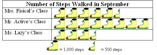
Figure 5: Example of a pictograph
After reading the graph above, one can see the following results: Mrs. Fisical’s class walked 5,500 steps, Mr. Active’s class walked 8,000 steps, and Ms. Lazy’s class walked 3,500 steps. This particular graph can be worked on as the month progresses so classes can see how many steps they are walking.
Bar Graph & Double Bar Graph
A bar graph, also known as a bar chart, “is a chart with rectangular bars of lengths proportional to that value that they represent. Bar charts are used for comparing two or more values. The bars can be horizontally or vertically oriented. Sometimes a stretched graphic is used instead of a solid bar.”
13
Bar graphs are useful because they display data in an easy-to-understand way.
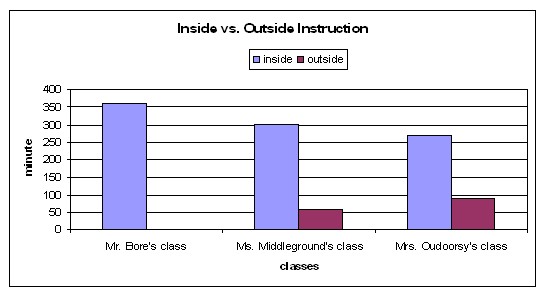
Figure 6: Example of a double bar graph that measures inside versus outside instruction time in three classrooms
Line Plot
A line plot is an easy way to organize data. This type of graph “consists of a horizontal number line, on which each value of a set is denoted by an x over the corresponding value on the number line. The number of x’s above each score indicate how many times each score occurred.”
14
In some cases, this graph may be referred to as a histogram.
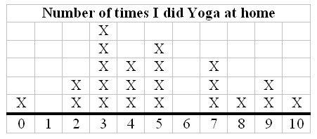
Figure 7: Example of a line plot that measures the number of times individual students practiced Yoga at home
Line Graph & Double Line Graph
“Line graphs compare two variables. Each variable is plotted along an axis. A line graph has a vertical axis and a horizontal axis.”
15
In many cases, the x-axis in a line graph denotes time.
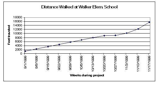
Figure 8: Example of a line graph showing the distance traveled by foot while walking in school
Pie Chart
Pie Charts, also known as circle graphs, display percentages and are used to compare different parts of the same whole.
16
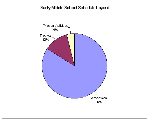
Figure 9: Example of a pie chart that divides up the schedule of activities for an average week at Sadly Middle School
Scatter Plot
The scatter plot is similar to the line graph; however, the purpose of the scatter plot is to show how much one variable is affected by another. This relationship is called their correlation. If both X and Y variable increase together the variables are said to have a positive correlation. If one increases while the other decreases, the variables are said to have a negative correlation.
17
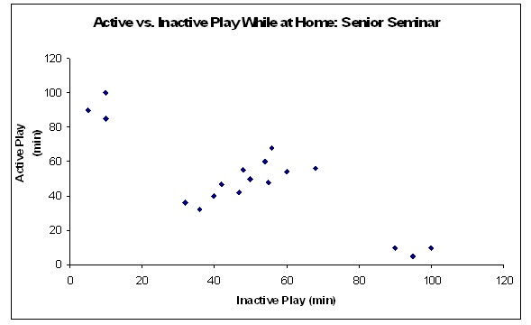
Figure 10: Example of a scatter plot comparing active versus inactive play for “example” high school seniors while at home; the middle values suggest a positive correlation between active and inactive play when calculating total amount of play time
Stem-And-Leaf Plot
The stem-and-leaf plot is similar to the line plot; however, the number line is usually vertical and digits are used instead of x’s.
18
Consider that a class measures student heart rates after physical activity; the raw data of such an event might look something like the following list after ordering the beats per minute from least to greatest:
61, 84, 86, 88, 92, 99, 99, 99, 113, 114, 121, 122, 124, 124, 127, 129, 138, 144, 147, 148, 151
A stem-and-leaf plot takes this raw data and organizes it in a way that visually makes more sense. This type of plot also makes finding mean, median, and mode much easier than looking at a random list of data. For example, just from looking at the stem-and-leaf plot one can see that the mean of this data will be somewhere around 115; the actual mean is 114.8. The median is 121. The mode is 99. A stem-and-leaf plot can also be a quick paper and pencil display of data while preserving all data points.
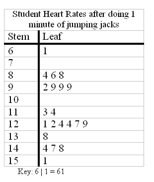
Figure 11: Example of a stem-and-leaf plot that shows a class’ breakdown of heart rates after physical activity